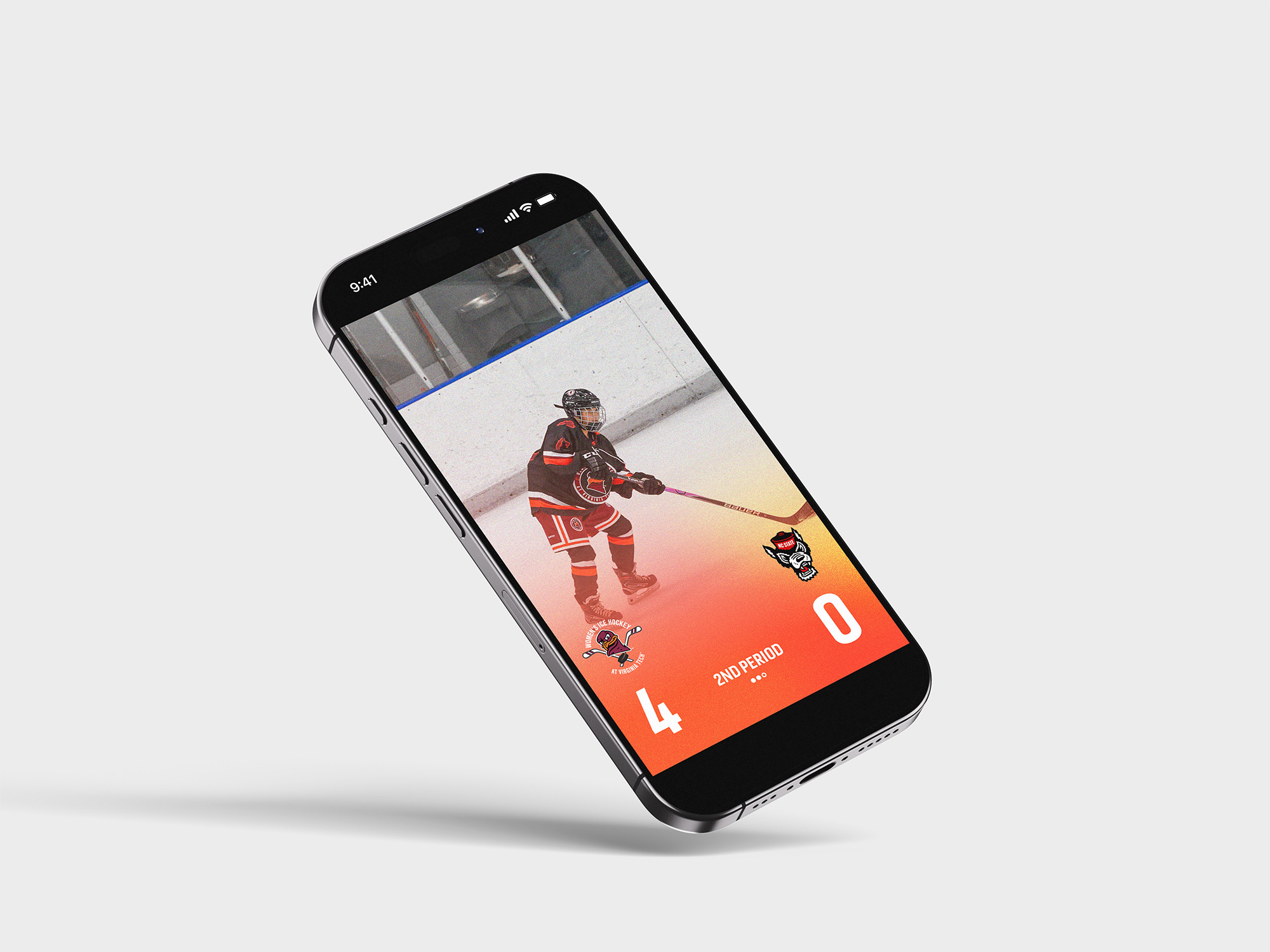
For this project, I was tasked with designing graphics for a preexisting or original event.
I decided to design for a hypothetical Super Bowl in Chicago due to the fact that I love the Chicago Bears.
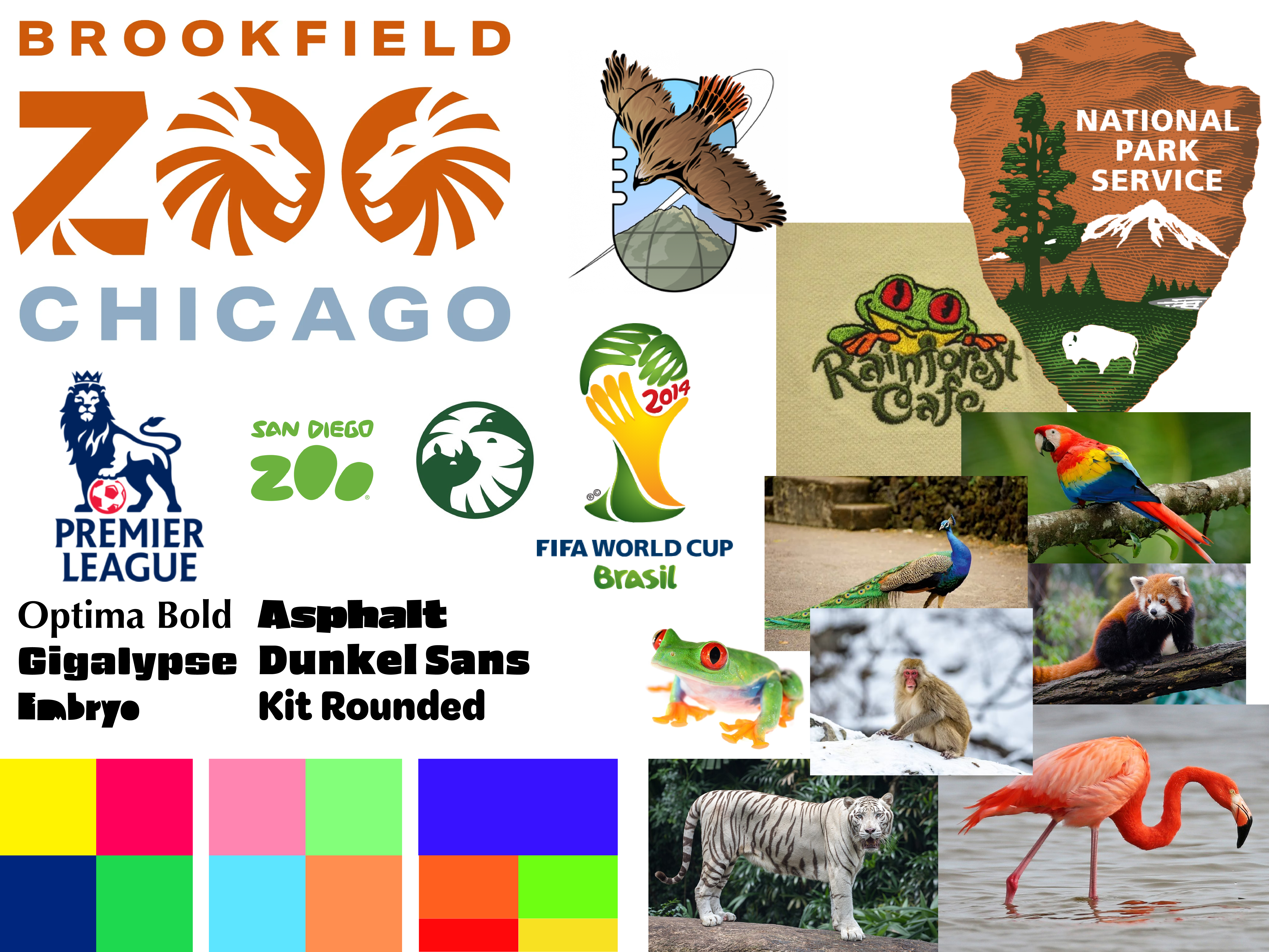
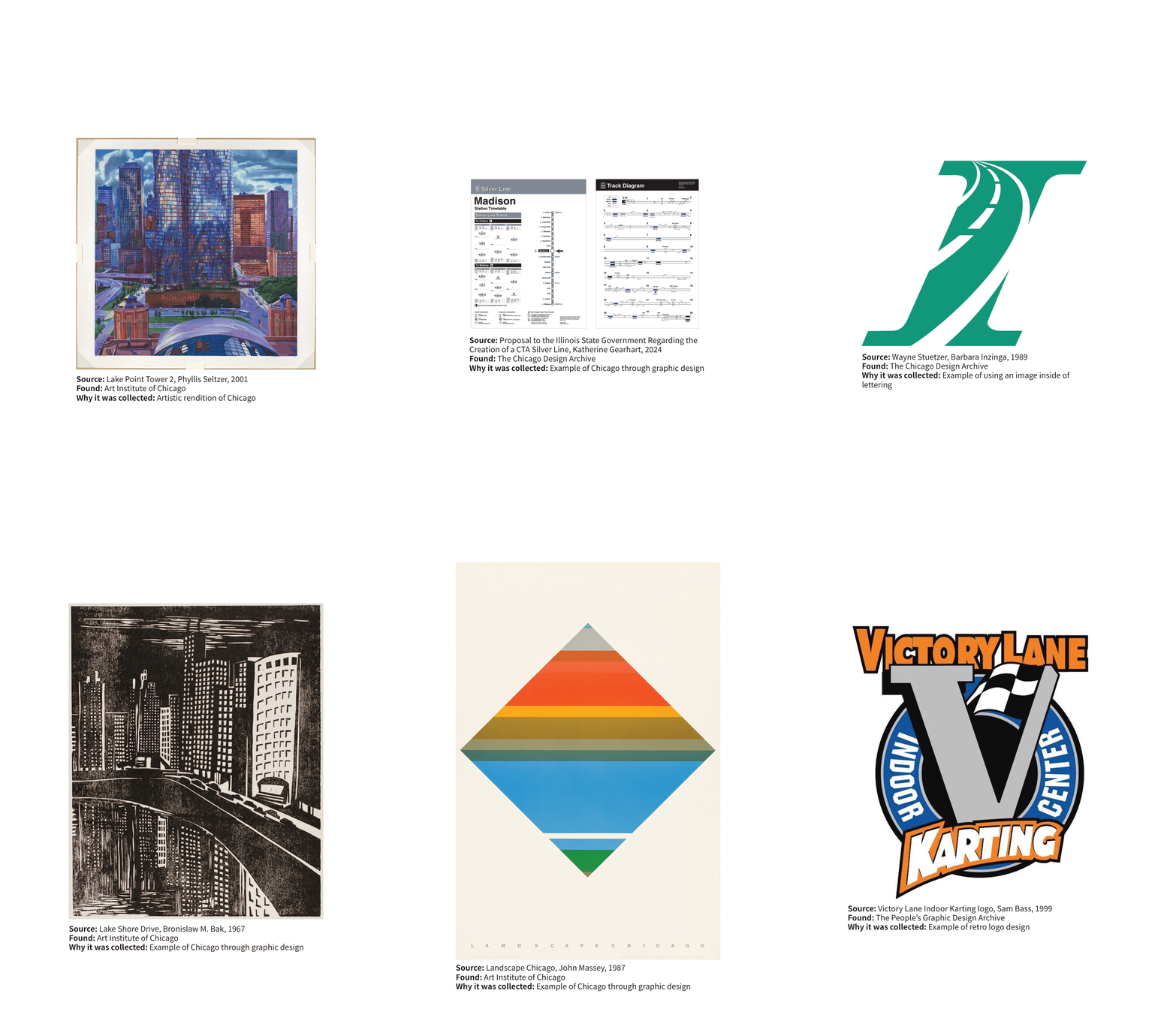
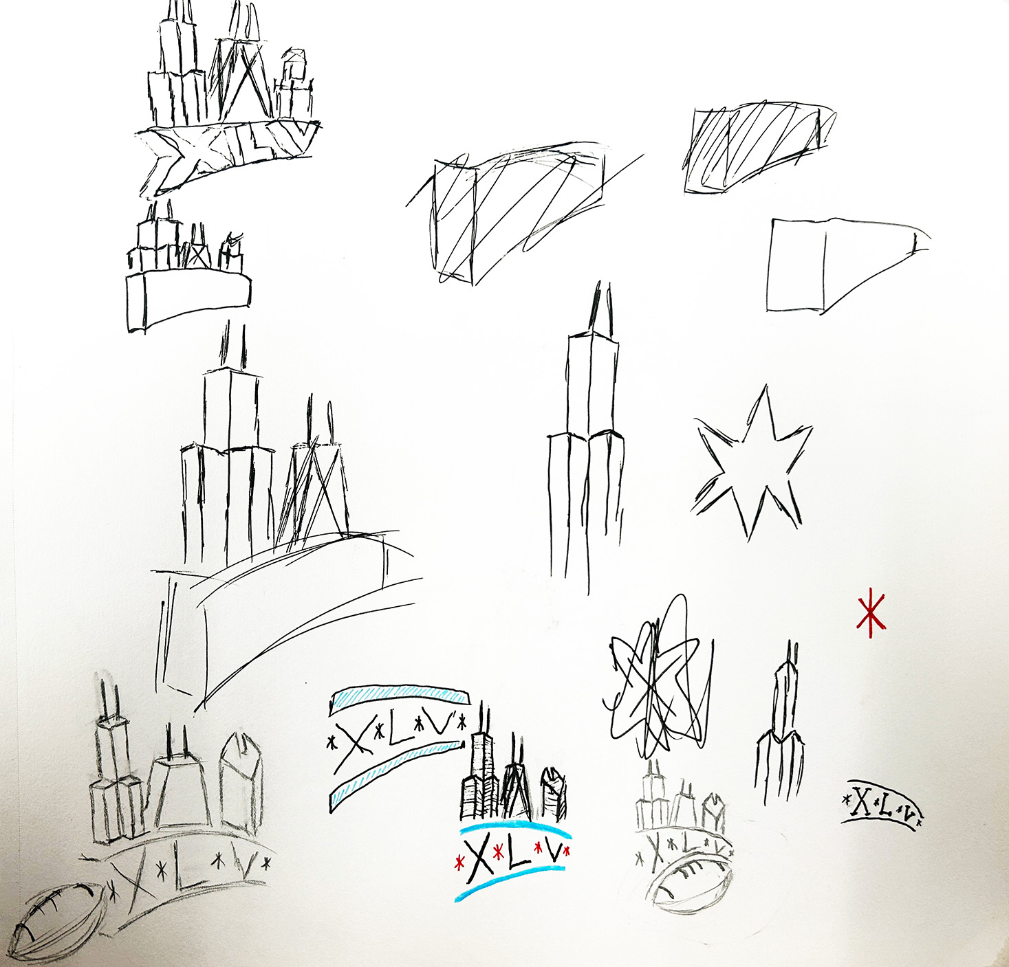
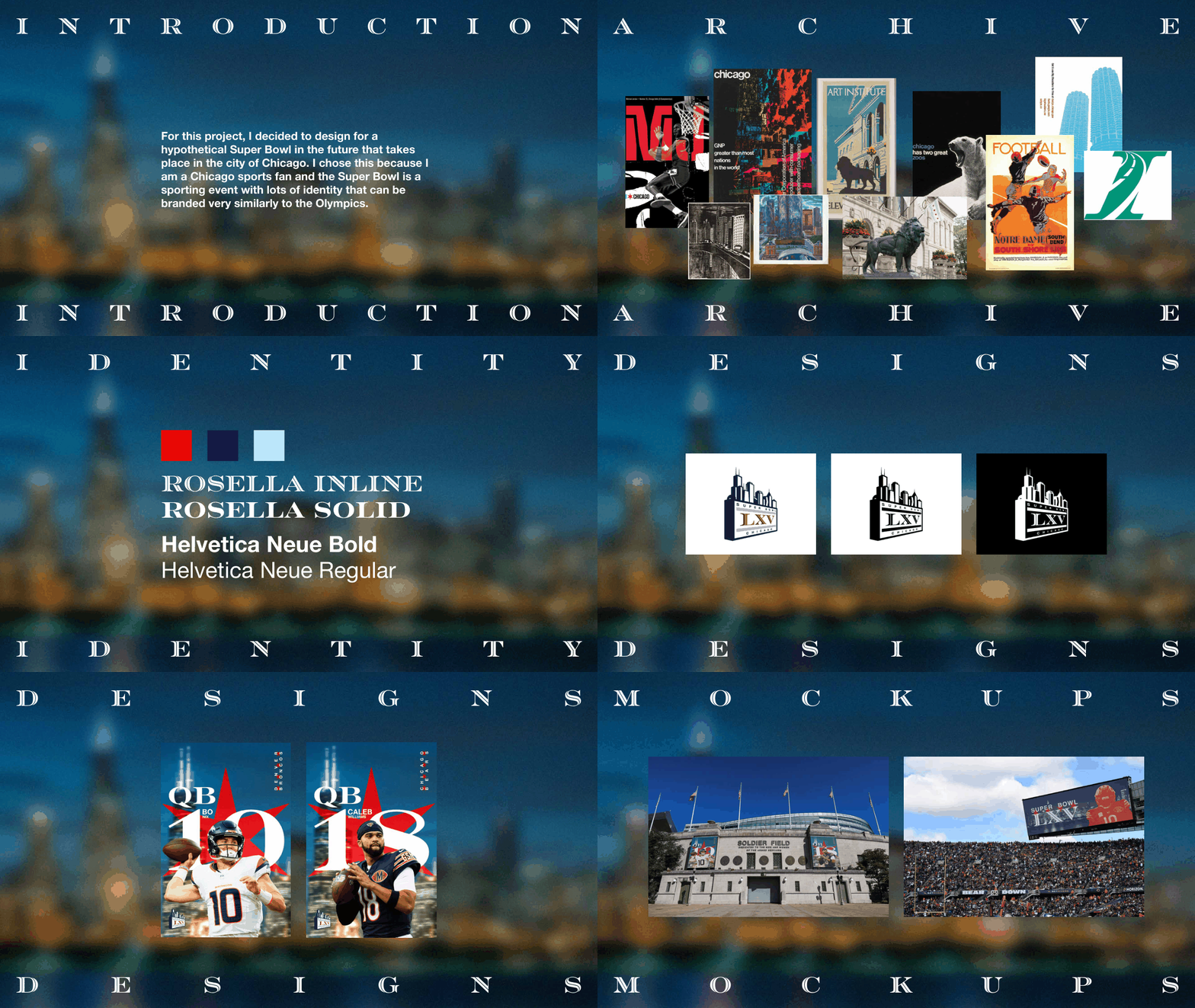
During this project I had to curate an archive to reference when making my event's visual elements.
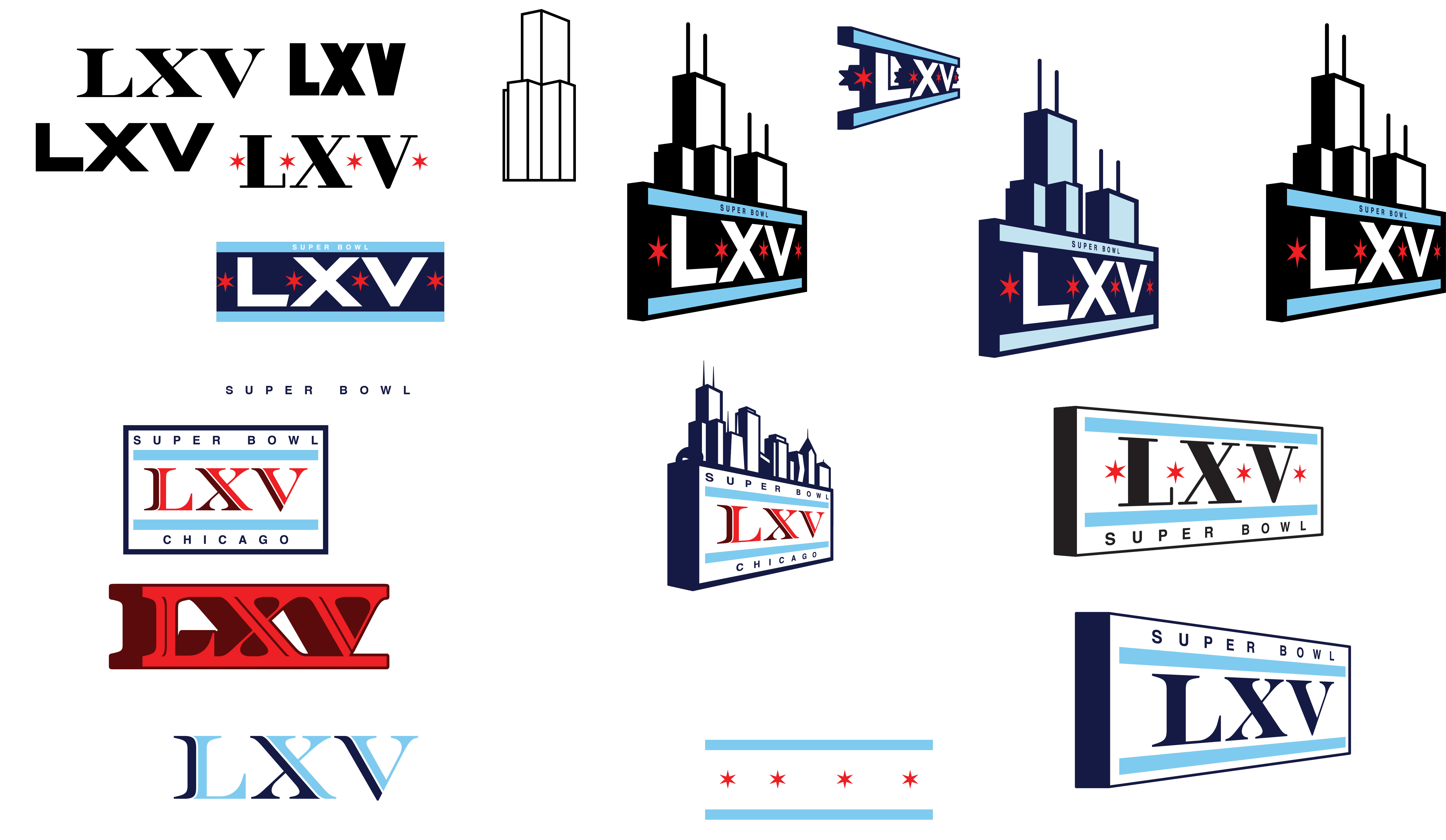
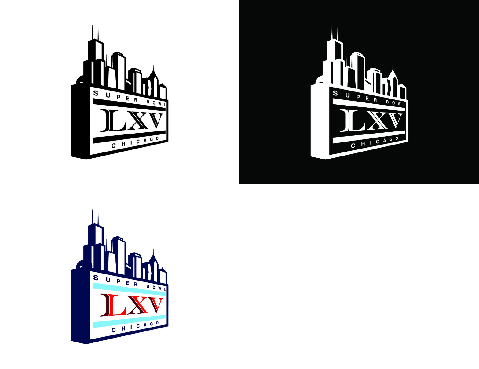
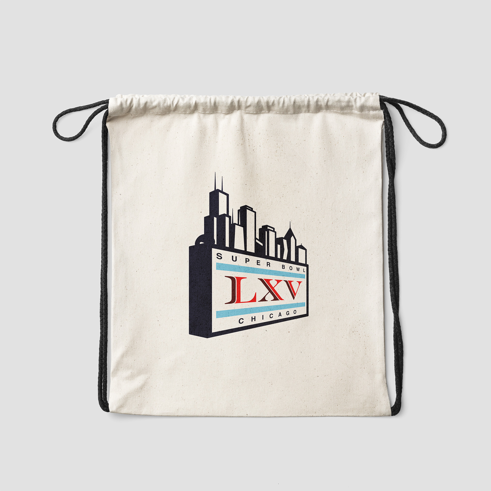
Super Bowl logo was designed to be a culmination of Chicago's visual identity by combining modern and art deco elements
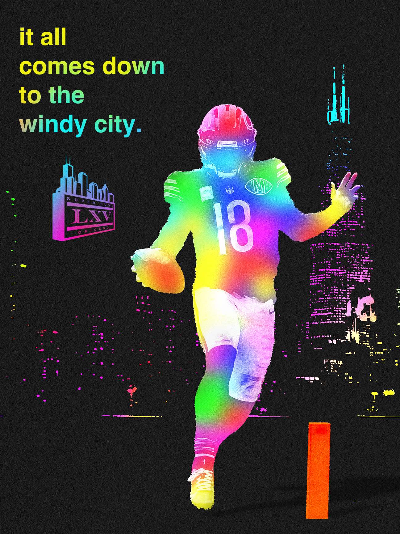
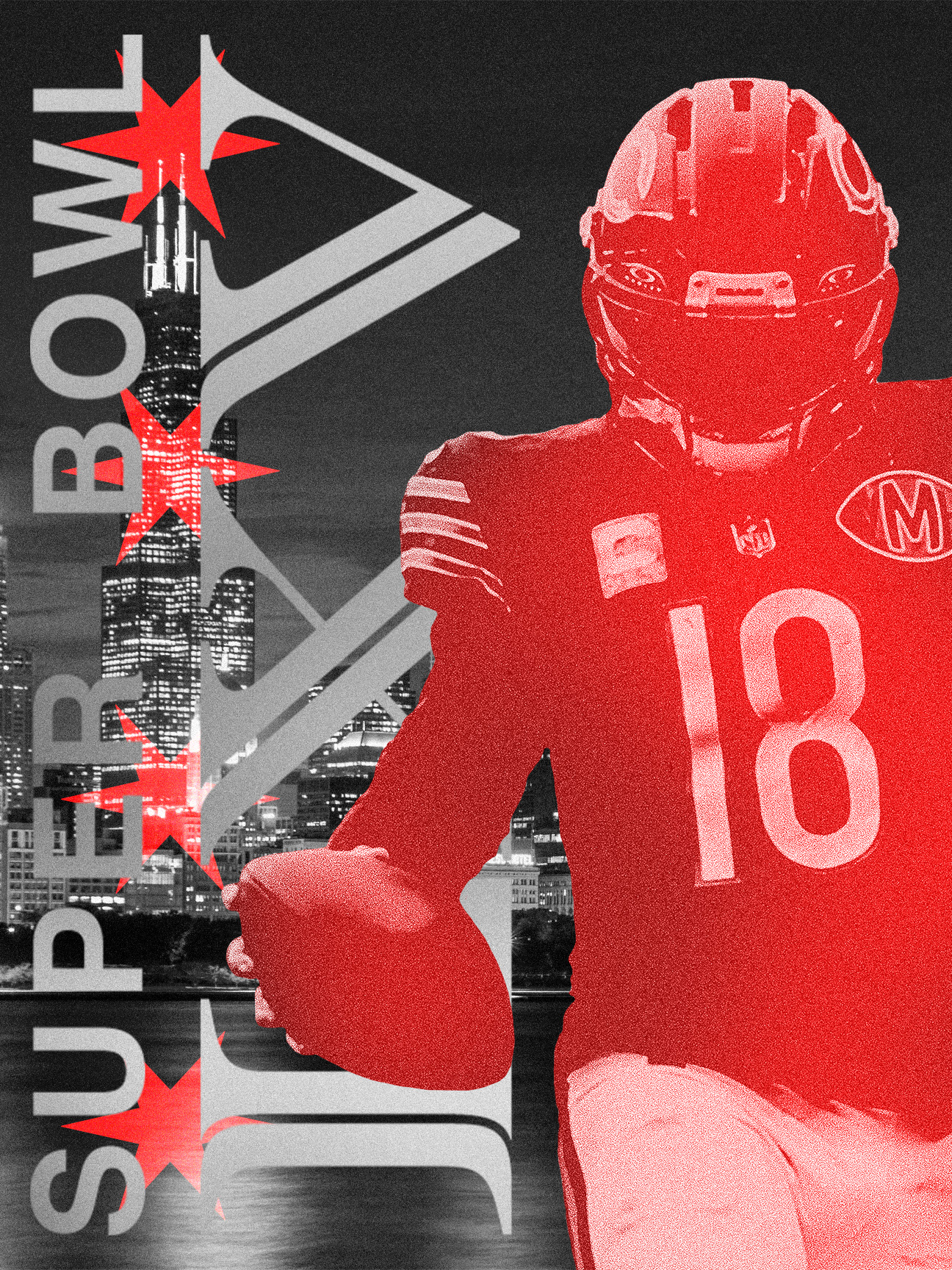
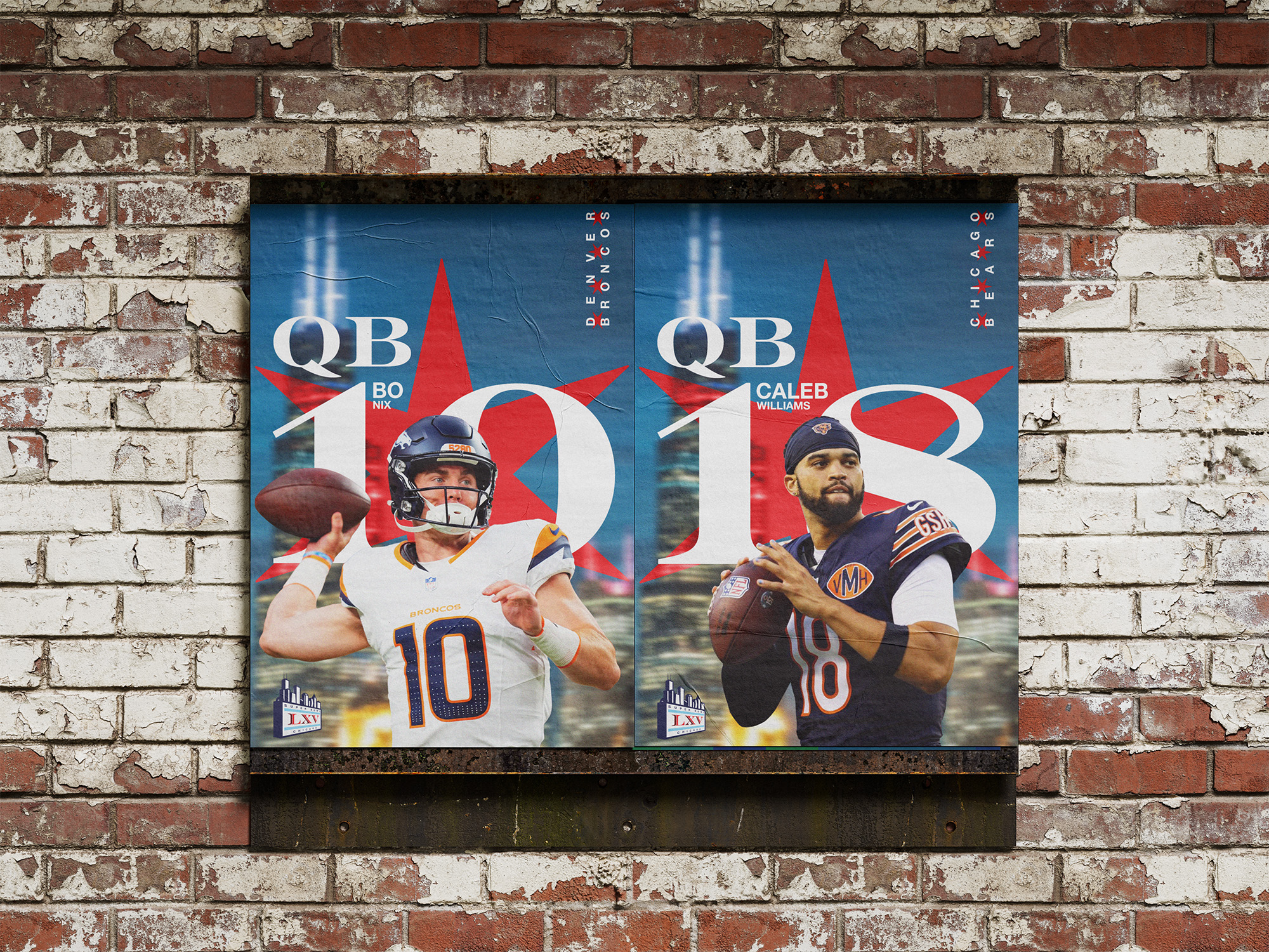
Player-specific graphics that would be seen on displays around the stadium and on social media
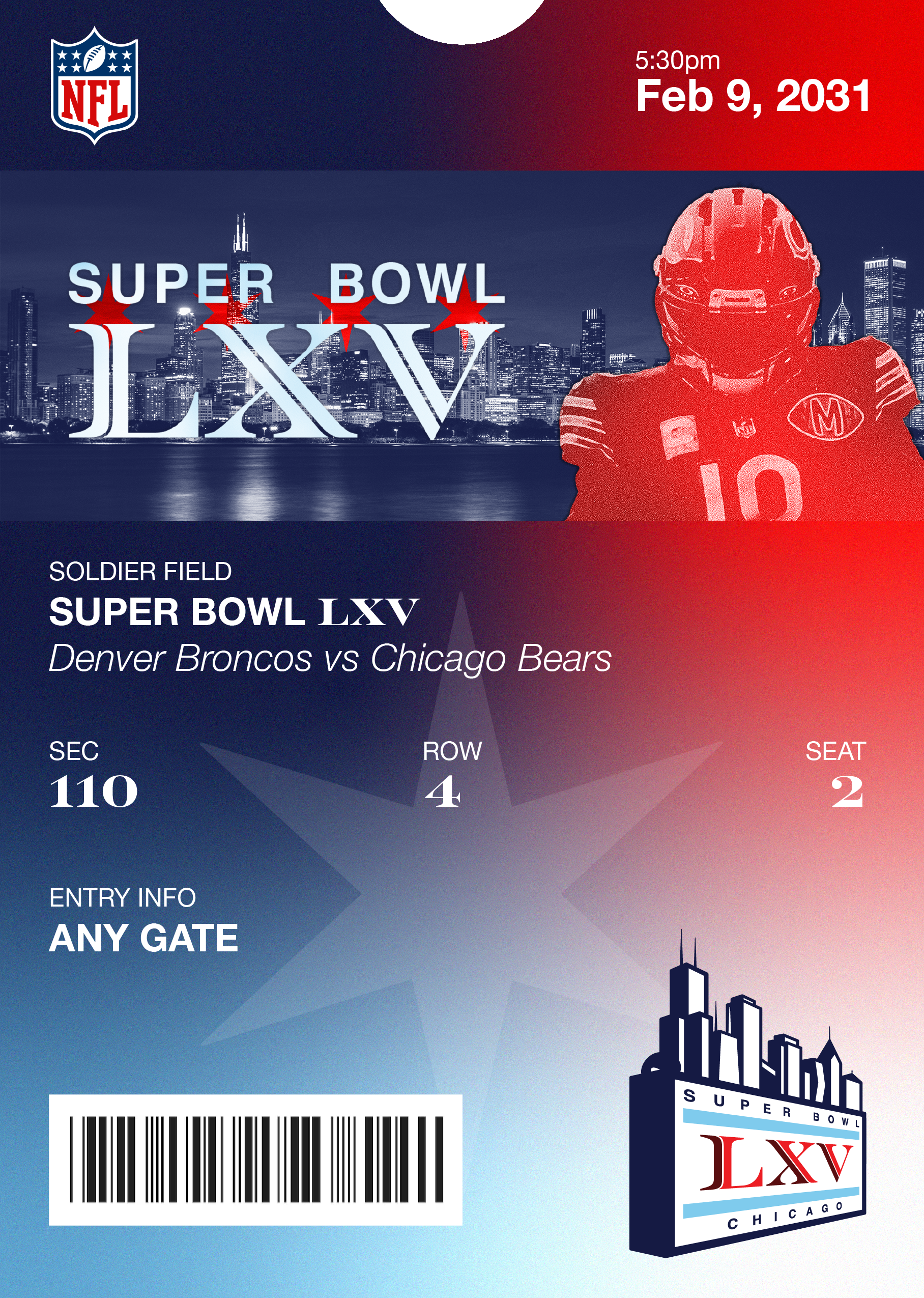
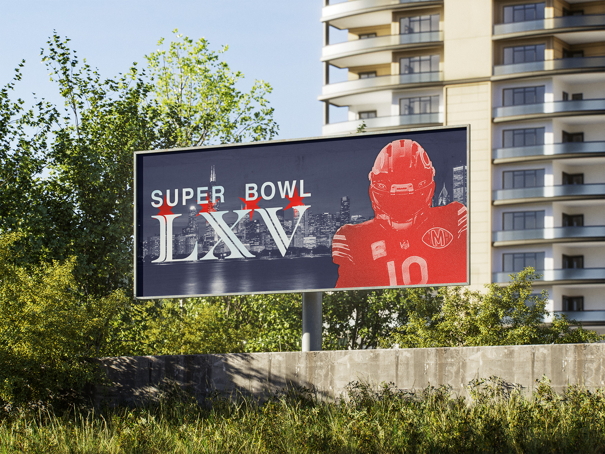
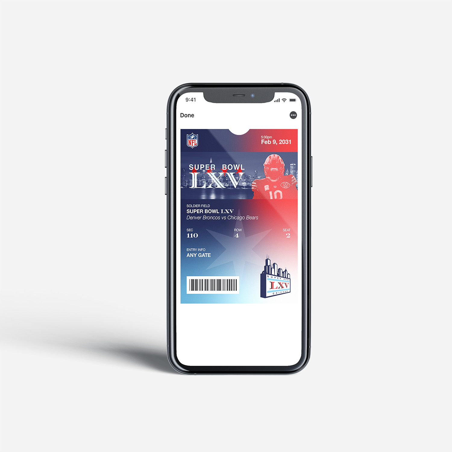
Banner graphic that would be seen on the digital ticket and jumbotron
Digital ticket
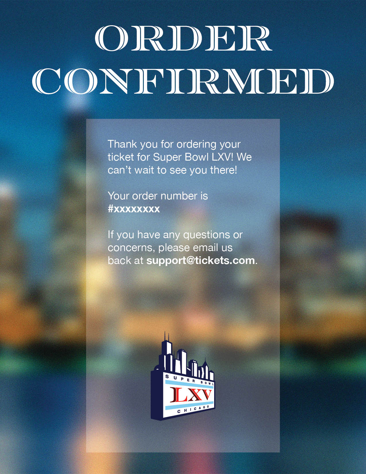
Ticket confirmation email
Olympic Design Project
Part 1: Visual Identity
For the first part of this project, I was tasked with designing the visual identity of a future Olympic games alongside a partner.
The city was chosen at random and we were given Istanbul, Turkey.
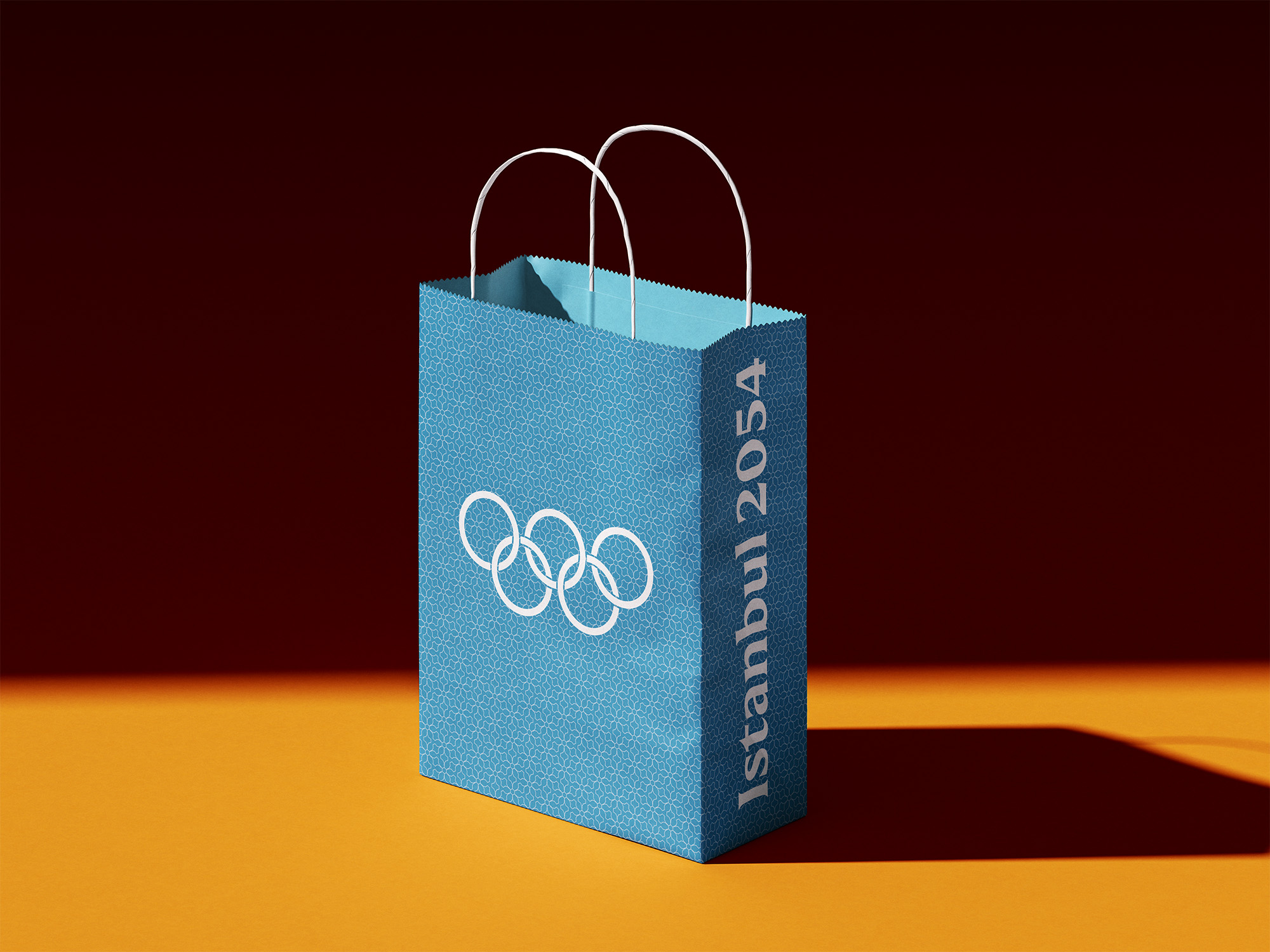
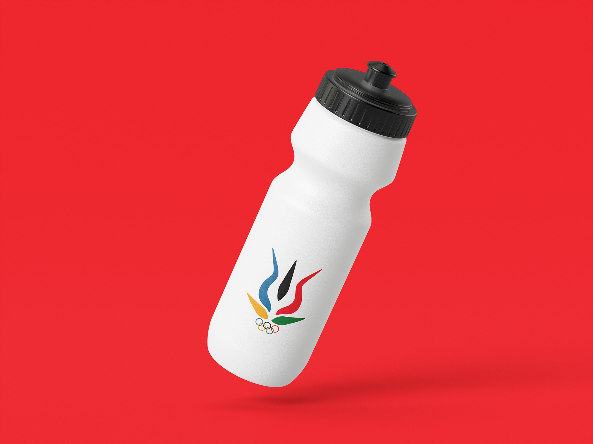
I ended up designing the main logo for the games and the logos for the events while my partner designed and curated the colors, motifs, and typography.
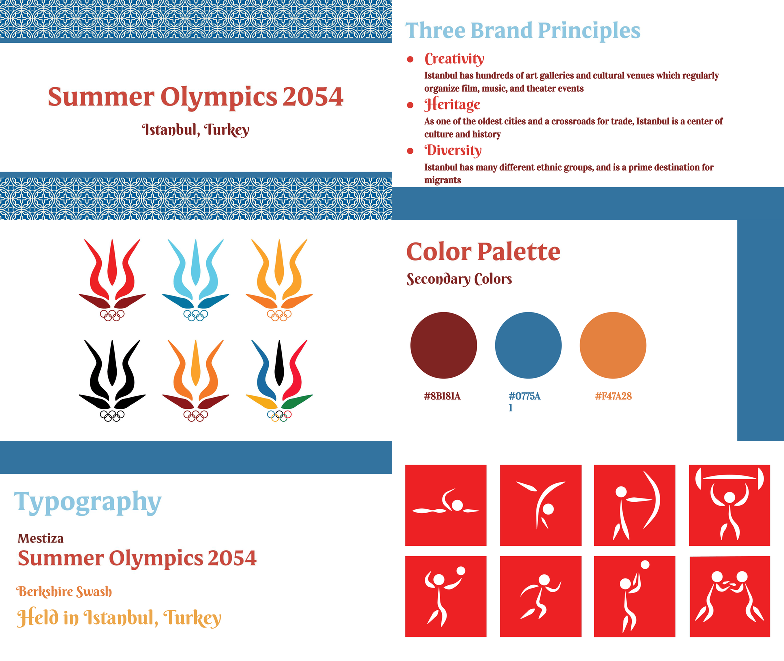
We decided that the 3 main principles of our games would be creativity, heritage, and diversity as they are particularly relevant to the city of Istanbul and its culture.
We then decided upon the color palette of red, blue, and gold due to their prominence in Turkish culture.
I am very happy with how our work turned out.
Collaborating with a partner enhanced the final product, because we were able to distill Turkish culture into a simple, yet faithful and distinct visual identity.
Due to the collaborative nature of the process, my partner's work influenced my work and vice-versa. As a result, this made our project's visual identity cohesive and high quality.
Part 2: Artifact Design
For the second part of the project, I had to design an "artifact" for my assigned Olympic games.
This "artifact" had to be an item that would be purchasable/obtainable at the Olympics that had to exemplify the themes, identity, and country of the Olympic games I helped design.
I decided to create a jacket that celebrates the Olympics.
This jacket was designed to be similar to warm-up jackets that are worn in sports like soccer and basketball which are very popular in Turkey.
The aesthetics of this jacket are supposed to celebrate the “heritage” and “diversity” themes of the 2054 Summer olympics with traditional Turkish/Arabic patterns.
What makes these jackets special is that the zipper charms are swappable.
Instead of pins being exchanged at this Olympics, country-related charms will be exchanged.
These charms can be used as zippers for the jacket, can be attached to jewelry, or used as keychains.
The many different uses of these charms is meant to encourage the frequent exchange of them so that Olympians can collect and use as many as they can.
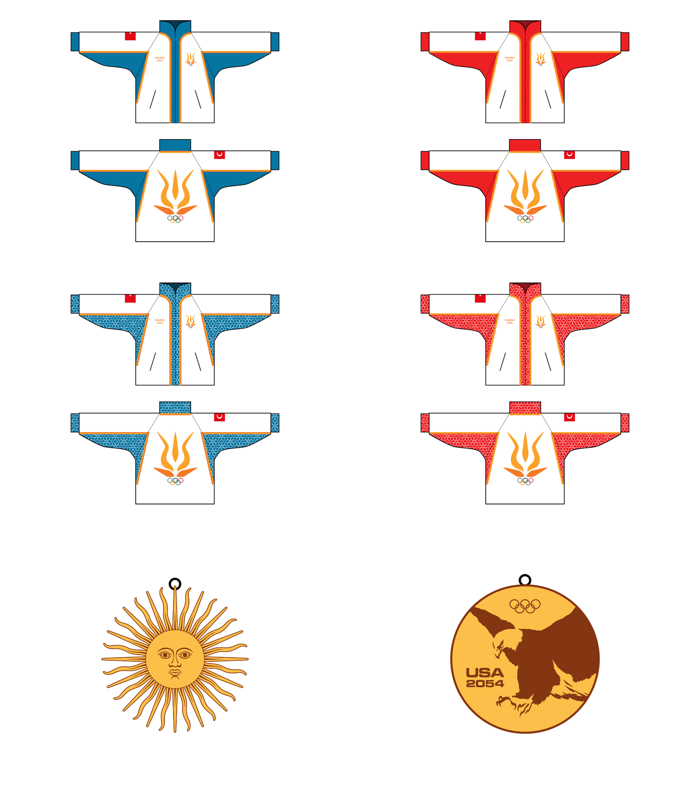
In the mock-up, some designs may take motifs from the country flag, for example, the Argentinian charm is the Sun of May, a symbol found in the Argentinian flag.
Some charms may celebrate other aspects of a country, for example, the American charm celebrates the bald eagle, and is shaped like a gold medal, and mentions the year of the olympics.
I am very proud of this creation, because it combines my love for fashion with my love for branding, graphic design, and sports.
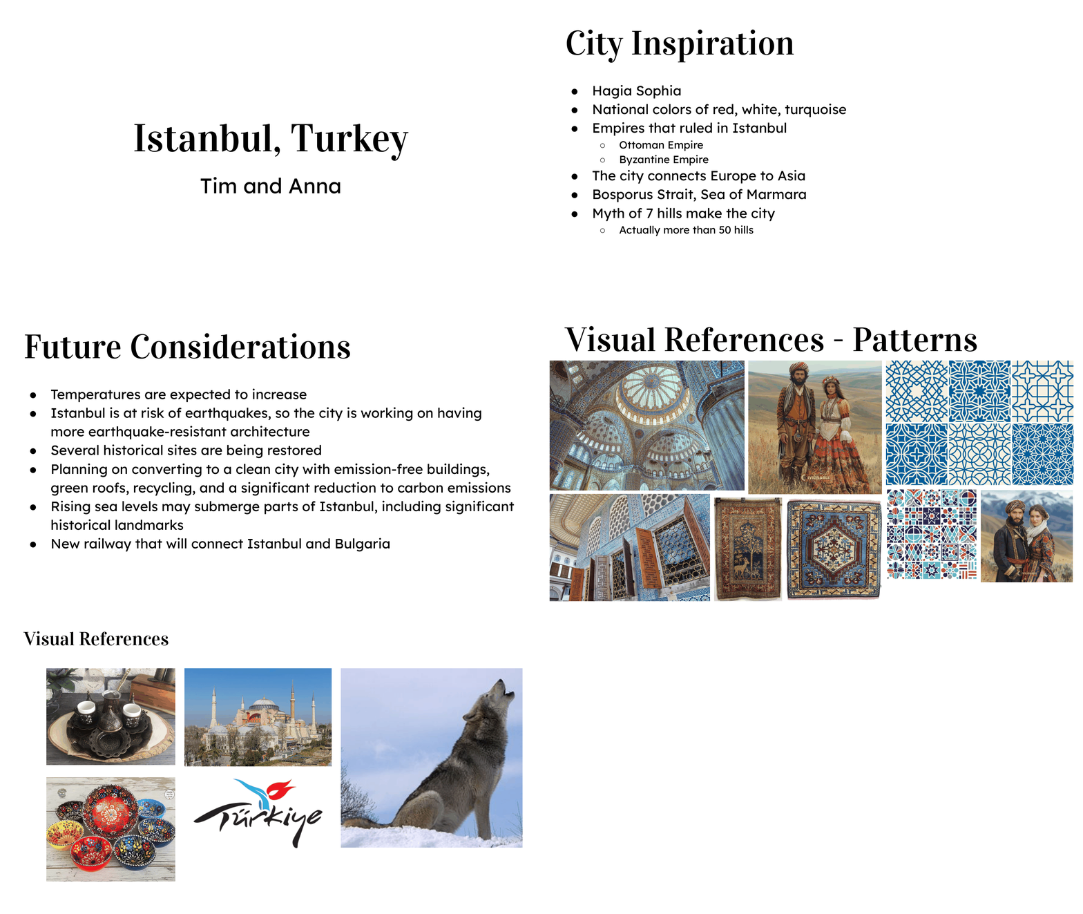
This is our presentation about our cultural research and visual moodboard.
We wanted to encapsulate Turkish culture as much as possible, especially since Istanbul is one of the most relevant cities in world history.
Ottoman art was especially important to us as it gave us a starting point for our visual identity.
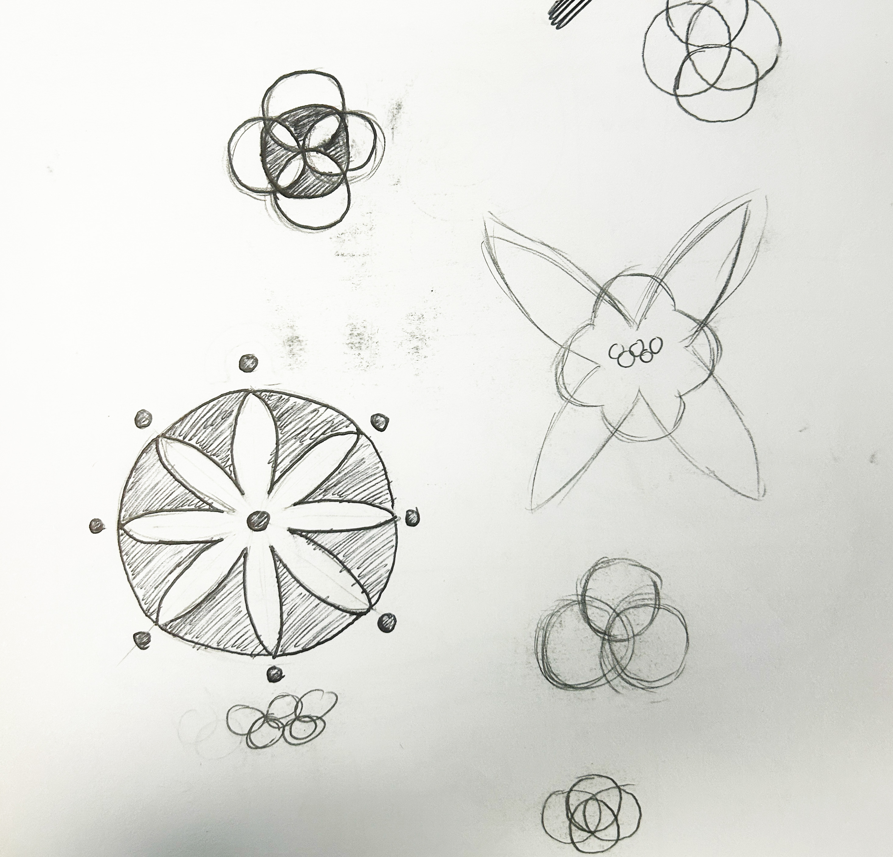
I was very inspired by the floral motifs on Turkish and Ottoman art, so I decided to iterate on that for my logo sketches.
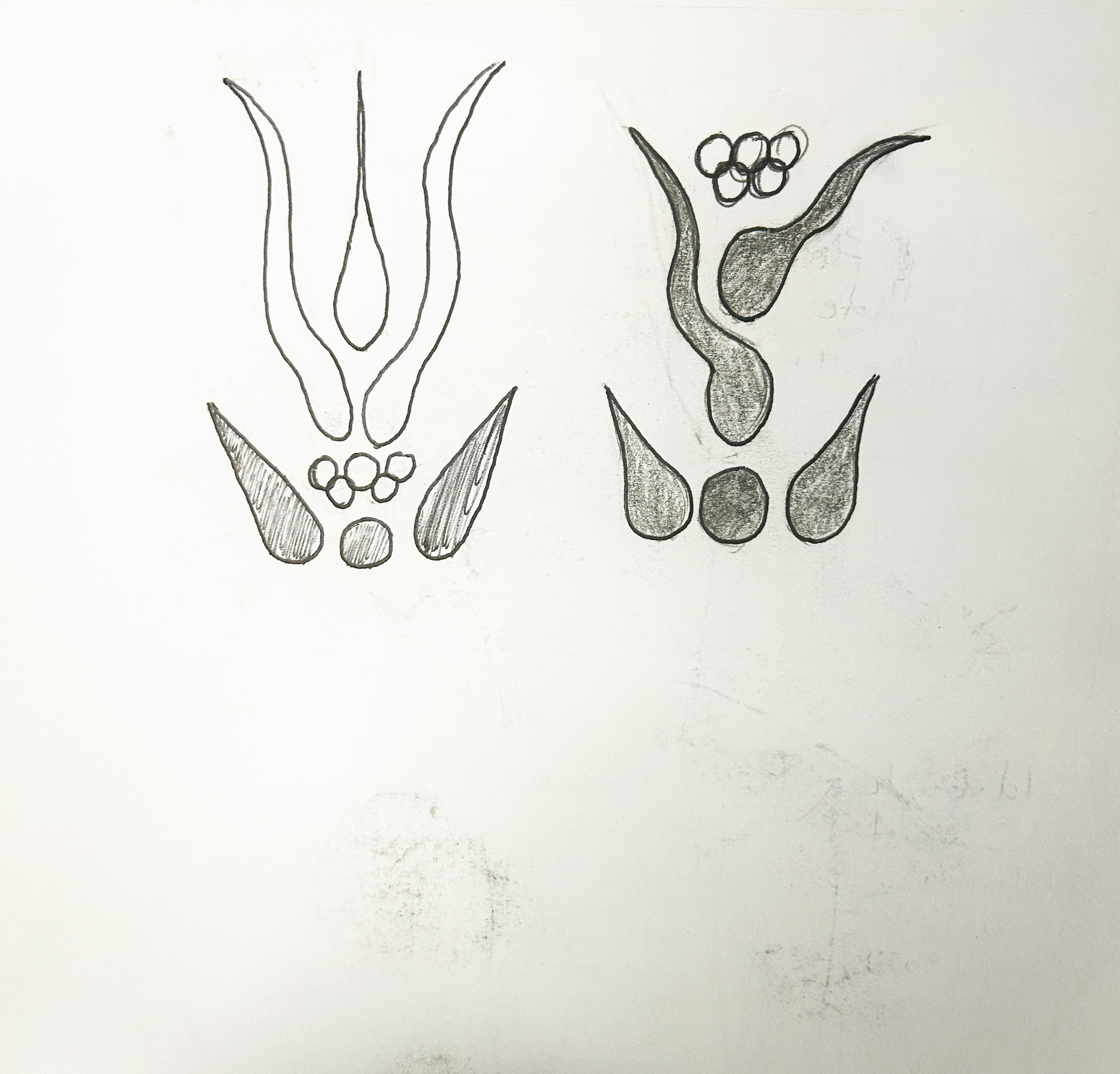
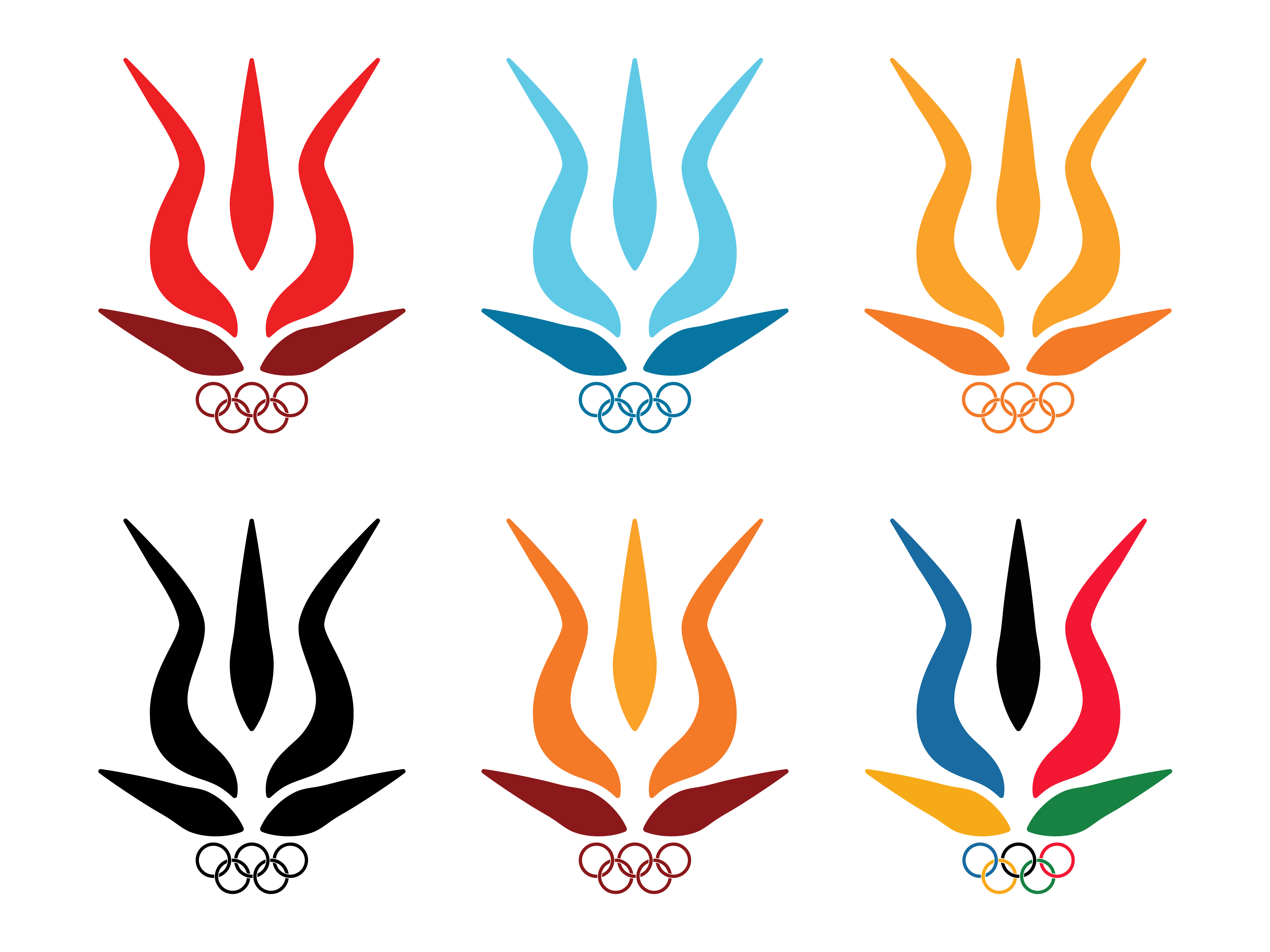
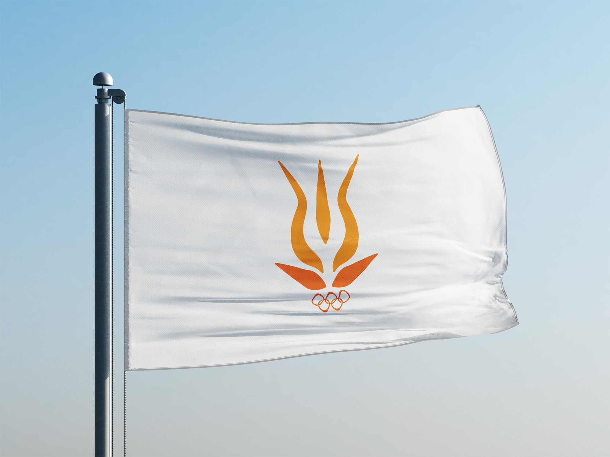
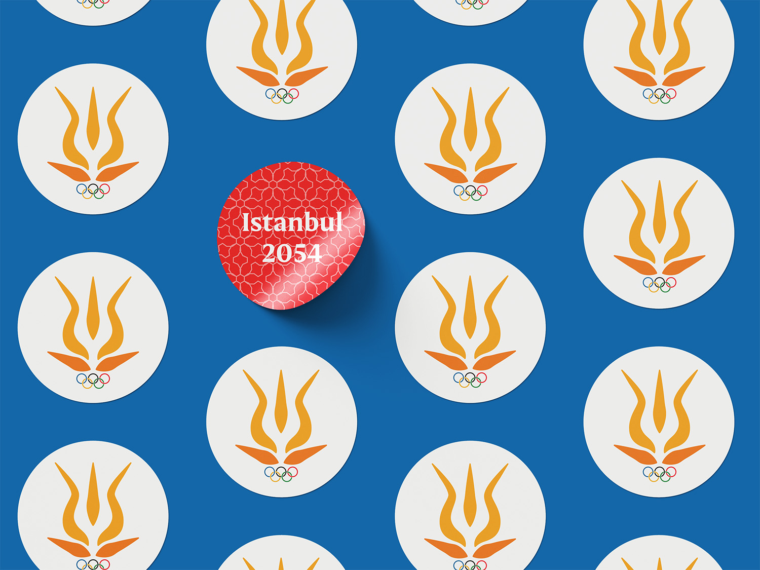
For the final logo, I went with a design that combines the tulip and the Olympic flame.
I did this because the tulip is one of the most prominent motifs in Turkish and Ottoman art and it shares a visual parallels to a flame, which is one of the most iconic symbols in the Olympic games.
For the event-specific logos, I didn't sketch them out and began working on them in illustrator instead.
This is because I wanted them to be visually similar to the brush strokes seen on traditional Turkish and Ottoman pottery, and it was easier to visualize those concepts with strokes in illustrator than with pencil and paper.
This is the style guide my partner and I created going over our Olympic games' visual identity.
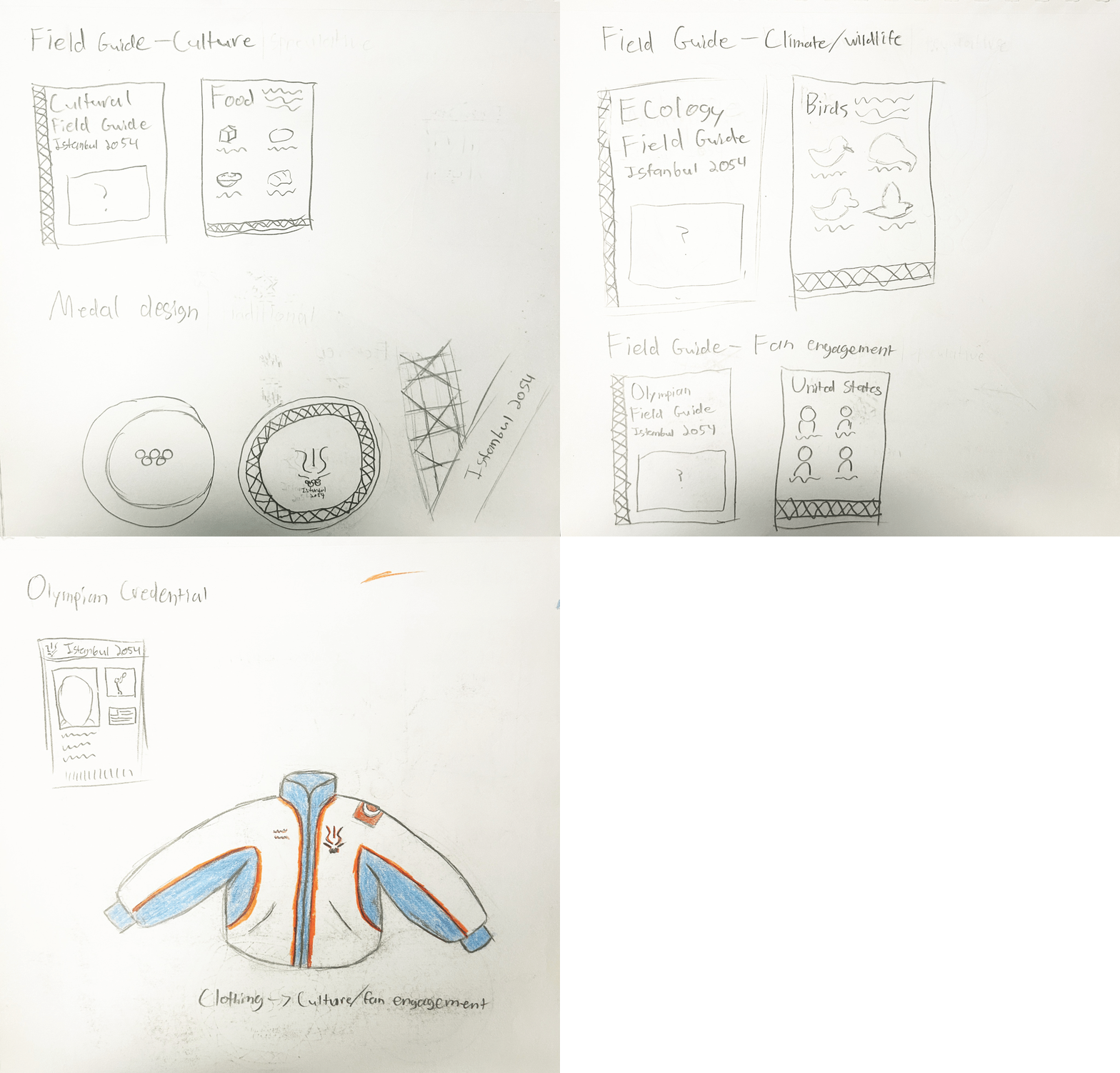
Originally, my cultural artifact was supposed to be a field guide made for tourists and fans visiting the Olympics.
This field guide would have showcased Istanbul's food and wildlife, and also showcased the Olympians from each country similar to that seen in match programs.
I ended up scrapping this idea and sketching the concepts for a jacket due to the short deadline of the project and because of my love of designing clothes.
I think that I made the right decision, because I don't think the final field guide concept would have turned out as well as the final jacket concept.
For the final jacket design, I created multiple colorways since this jacket would also be purchasable by fans attending the games, and because I just enjoyed making variants of the jacket so much.
Some colorways integrate traditional Turkish and Ottoman patterns, while others utilize the Olympic colors and the official colors of Turkey.
While I never settled on an "official" colorway, I would say that the black and white jacket feels the most "Olympic" and the blue and white patterned jacket feels the most "Turkish".
So the "official" colorway would be one of those two in my opinion.
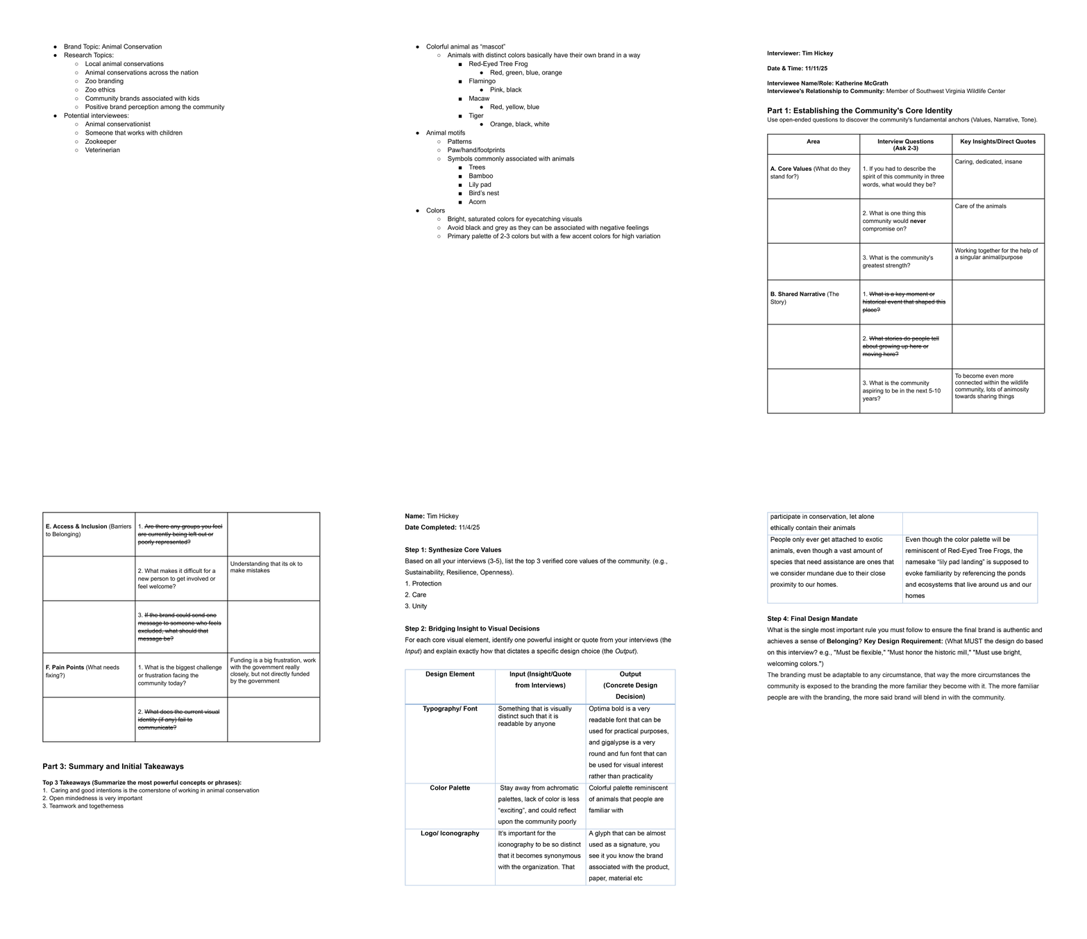
For this project, I was tasked with designing a brand that interacts within the local community.
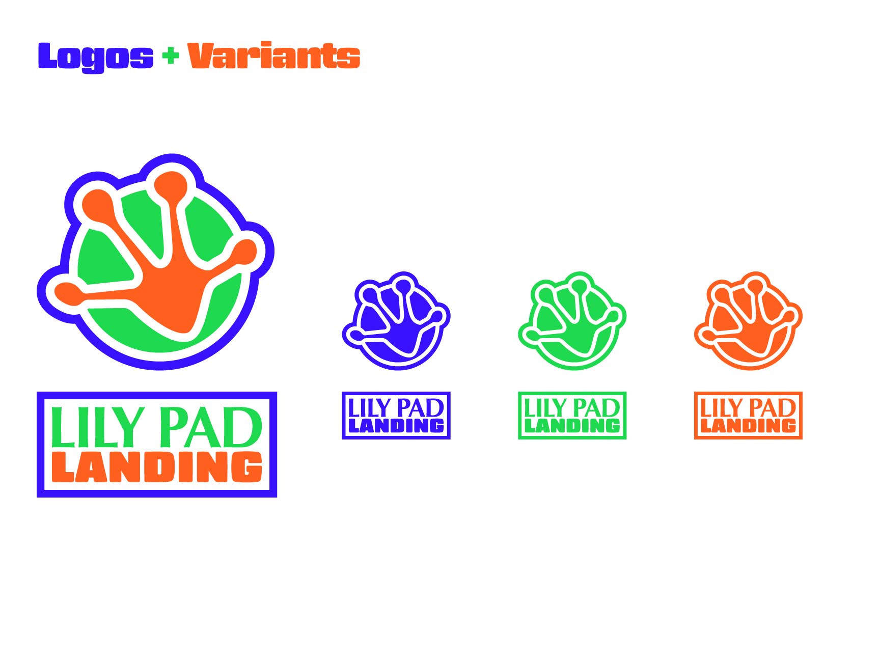
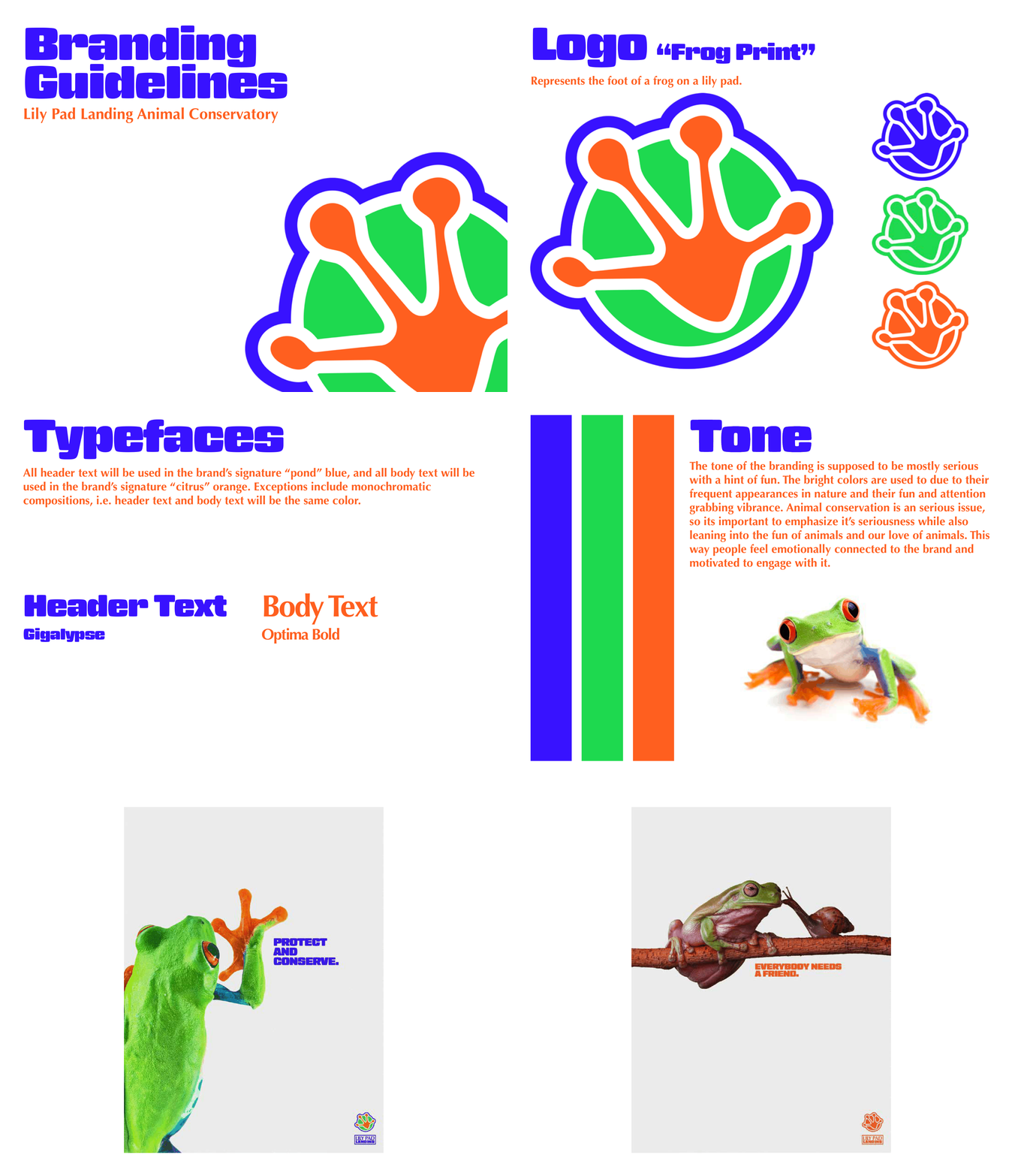
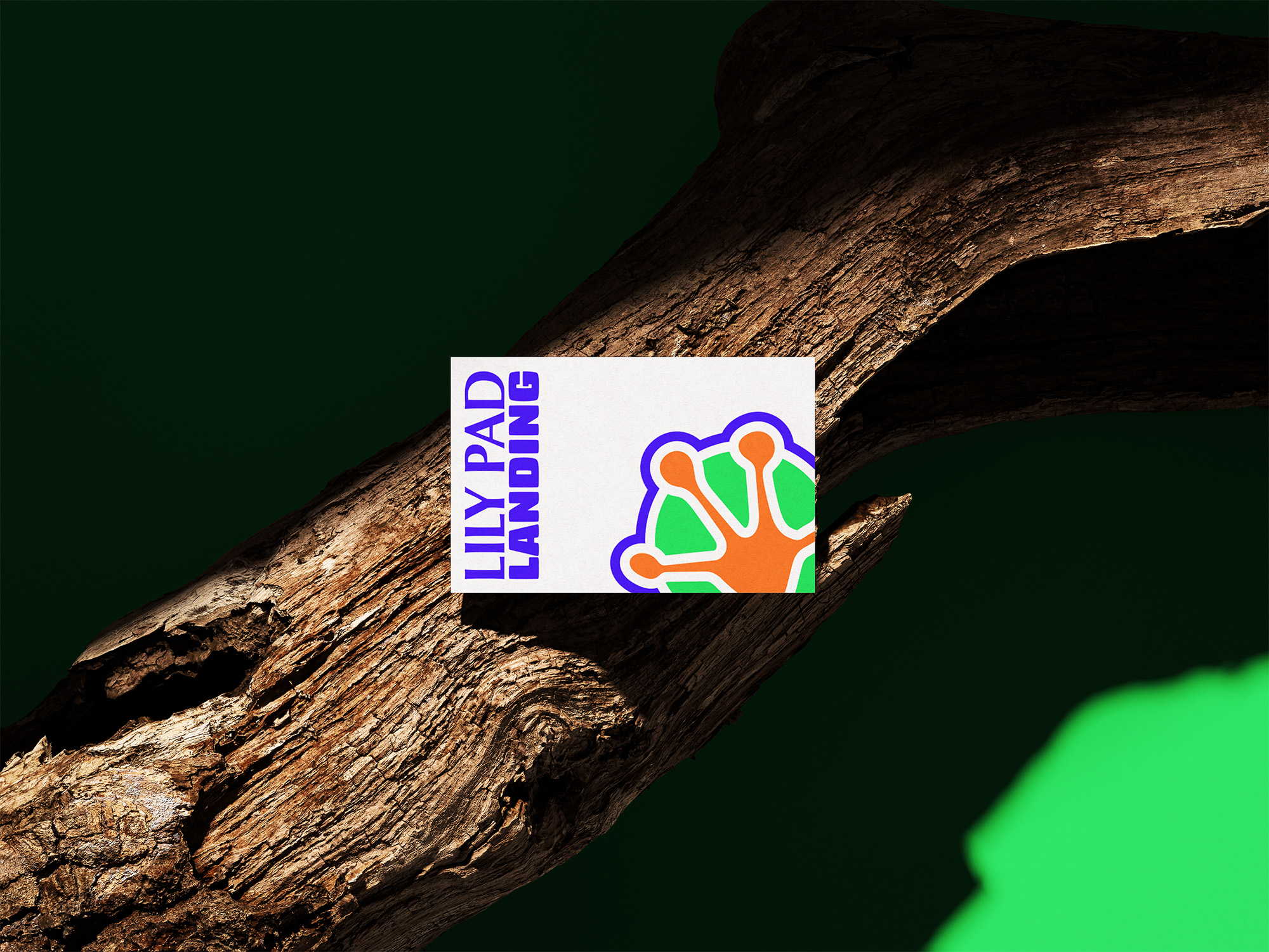
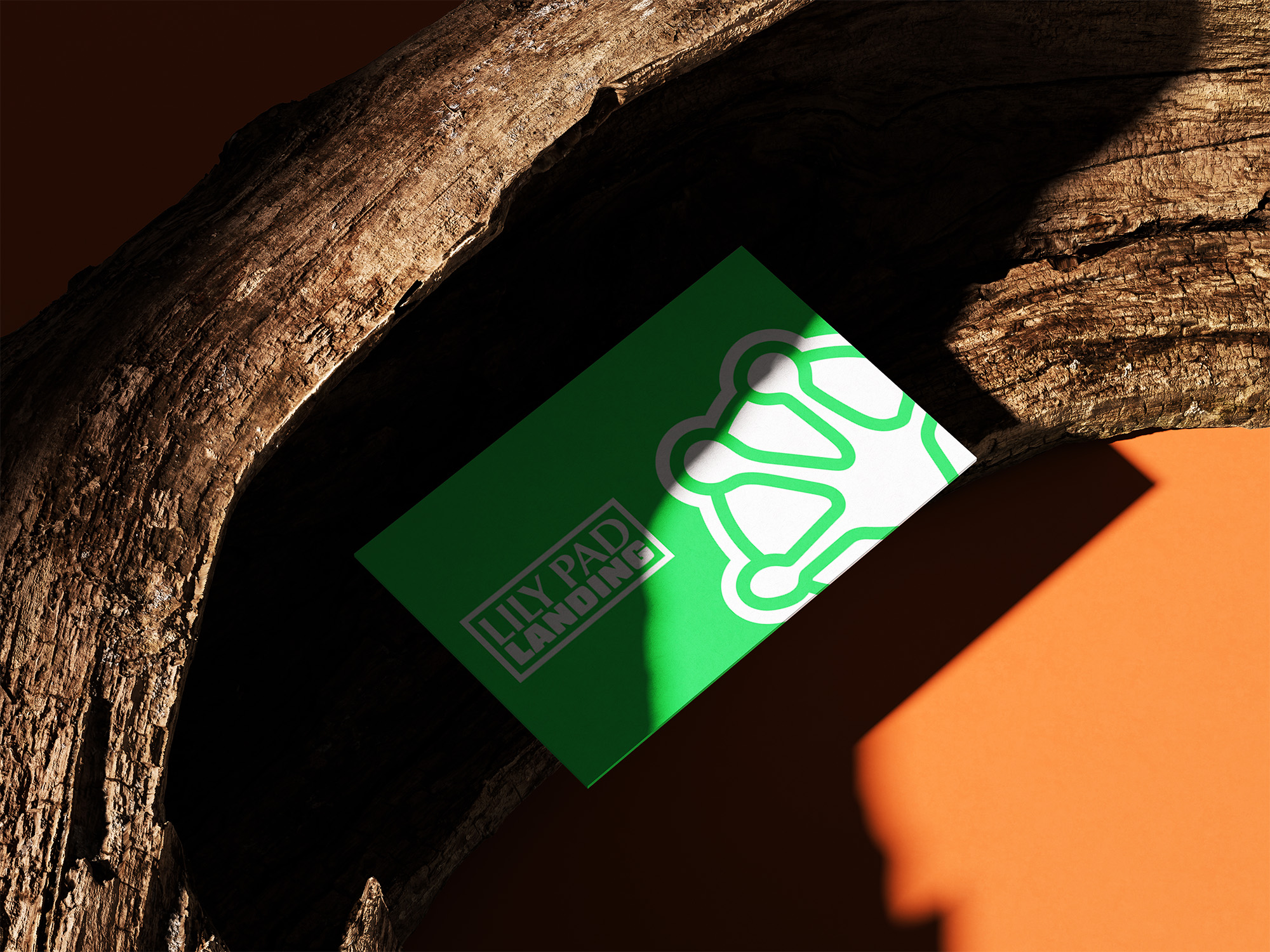
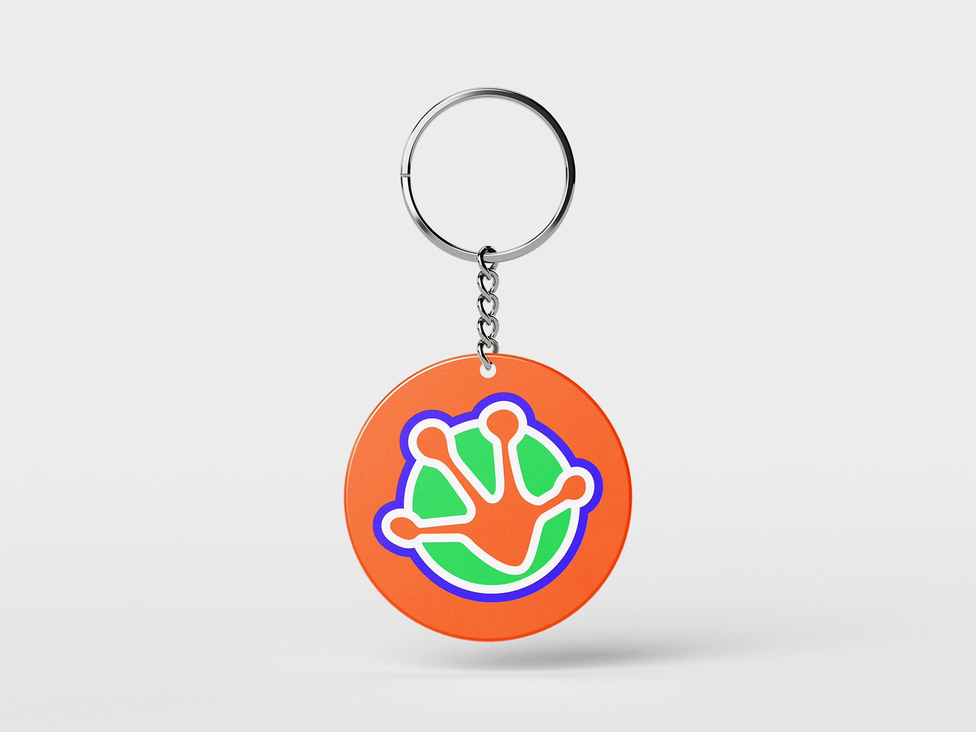
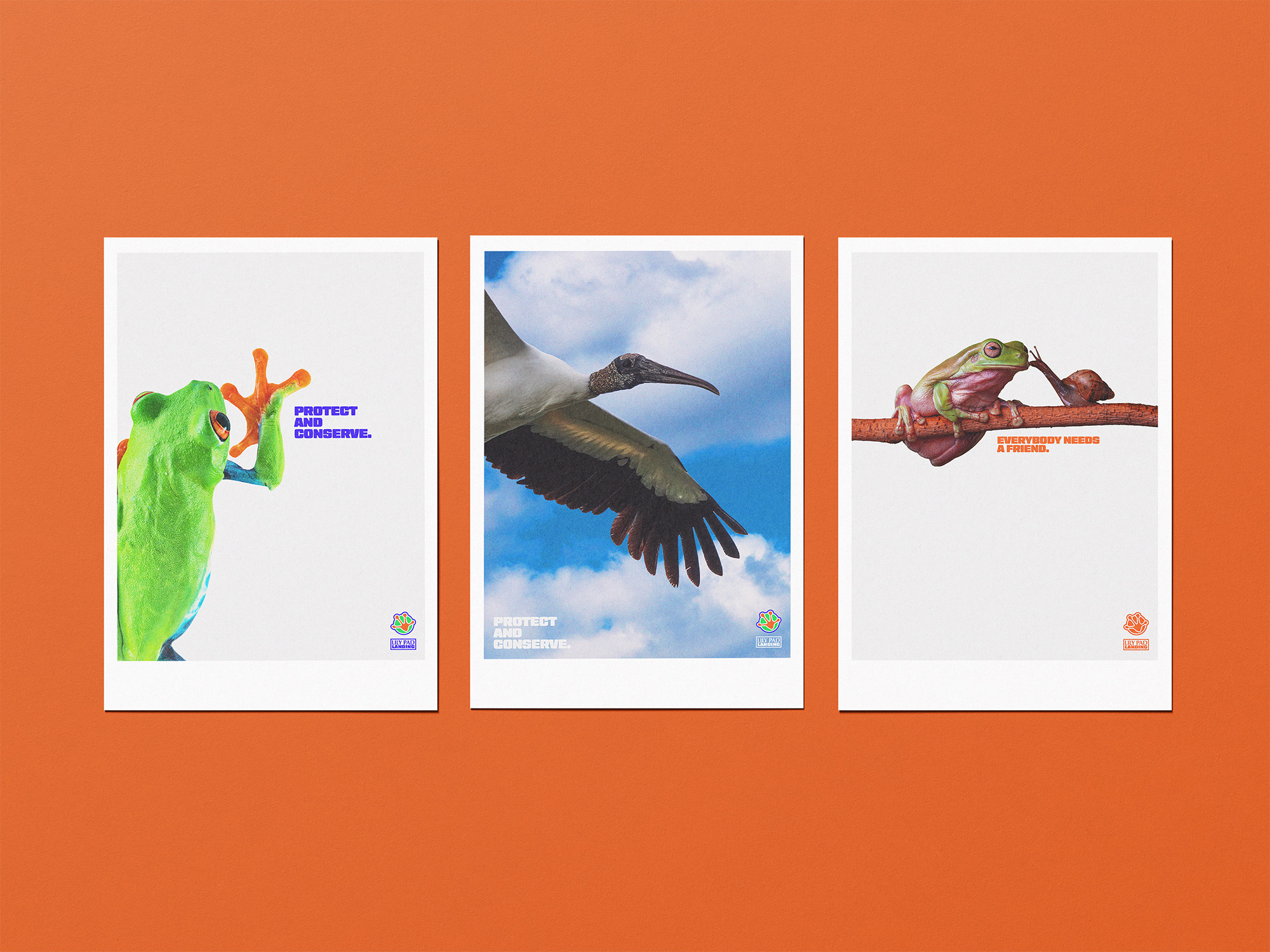
I designed an animal conservatory called Lily Pad Landing that specializes in the conservation and rehabilitation of animals that live in and around bodies of freshwater.
I chose to design branding for an animal conservatory because I have a personal love of animals, and people tend to forget that the ecosystem is apart of the local community.
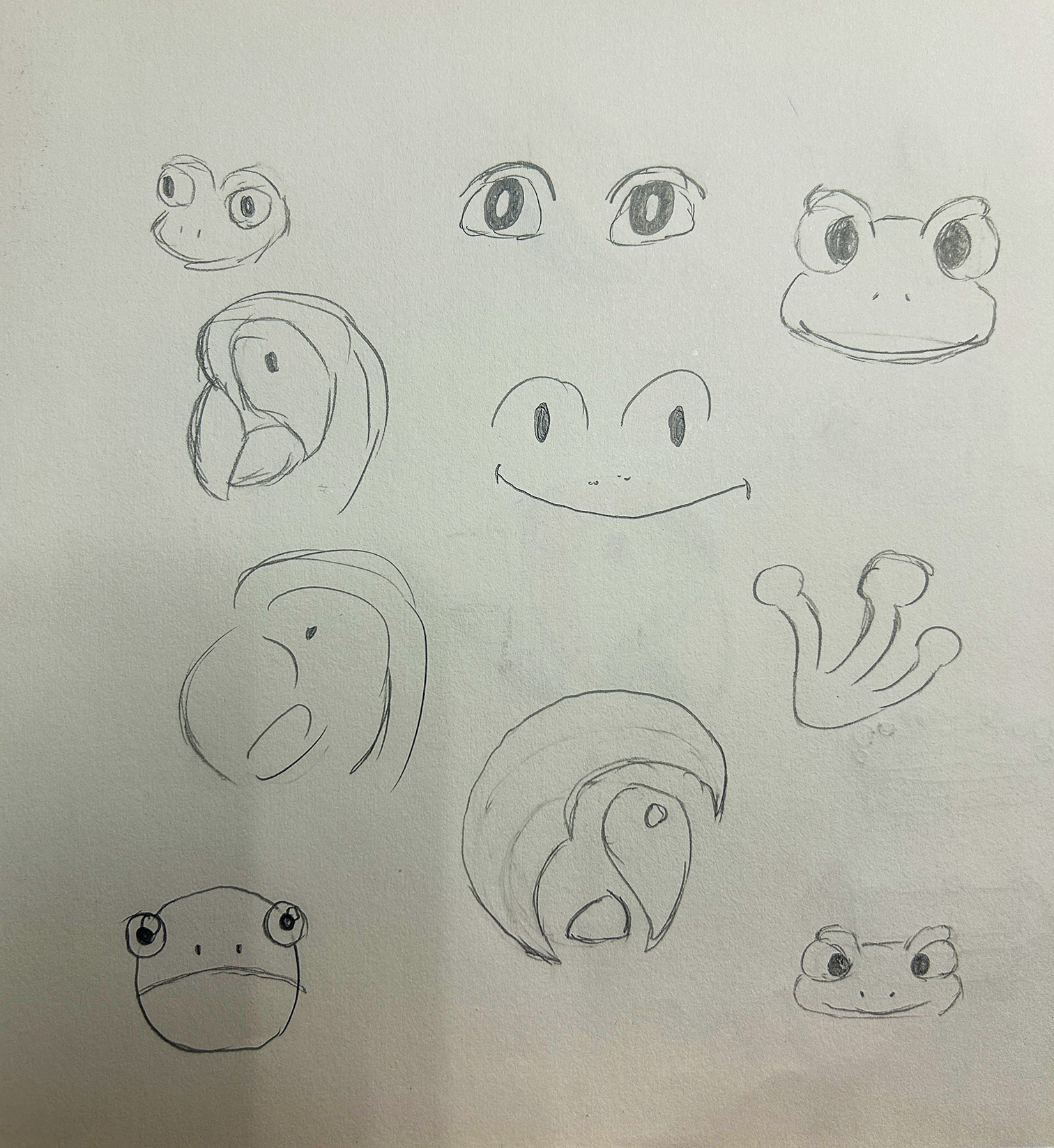
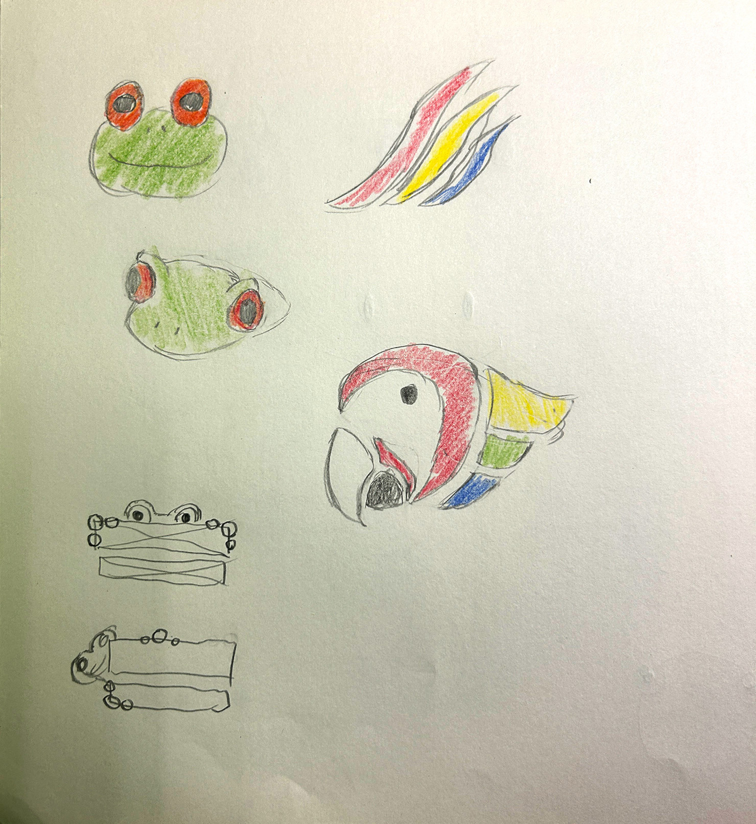
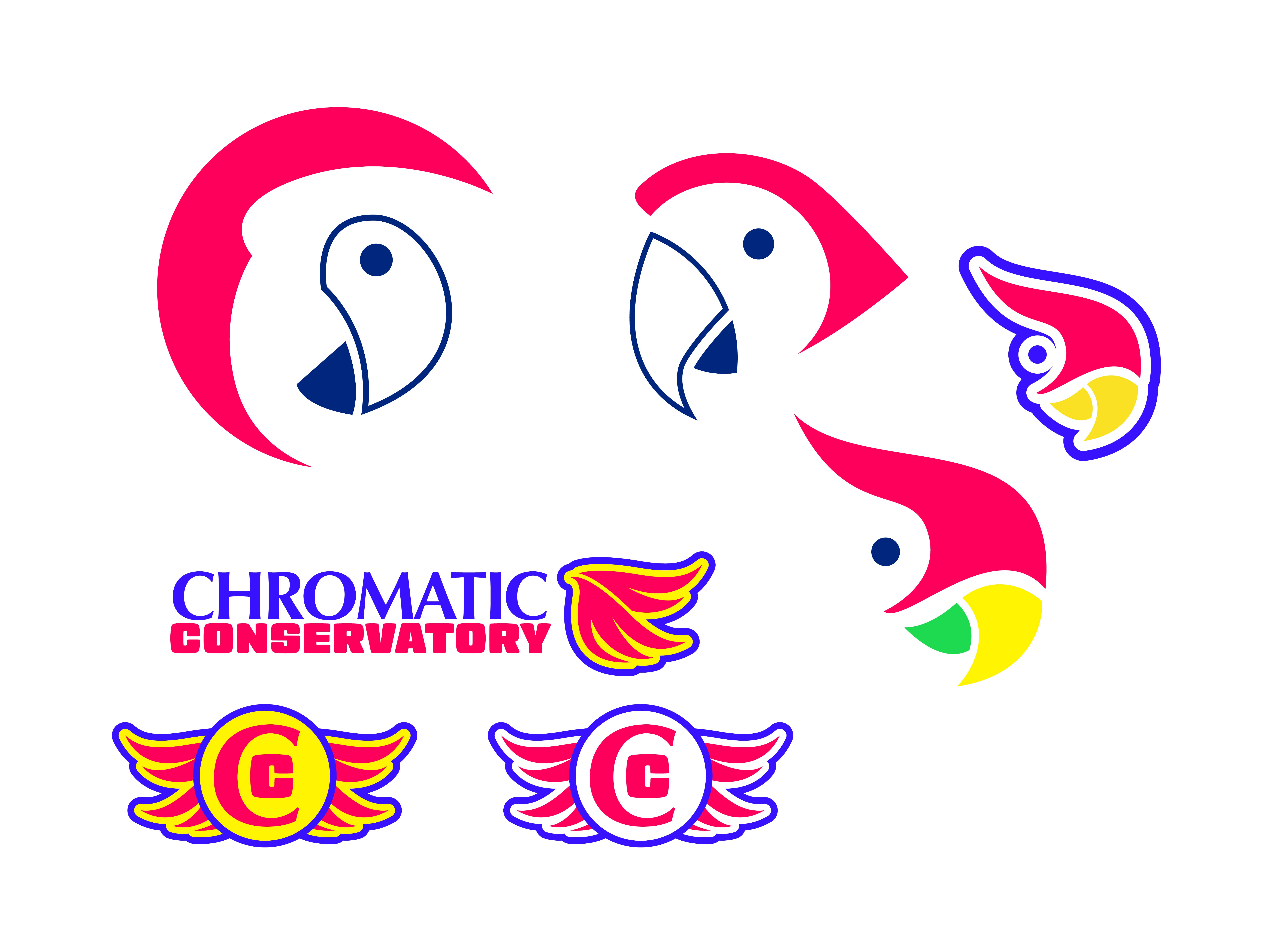
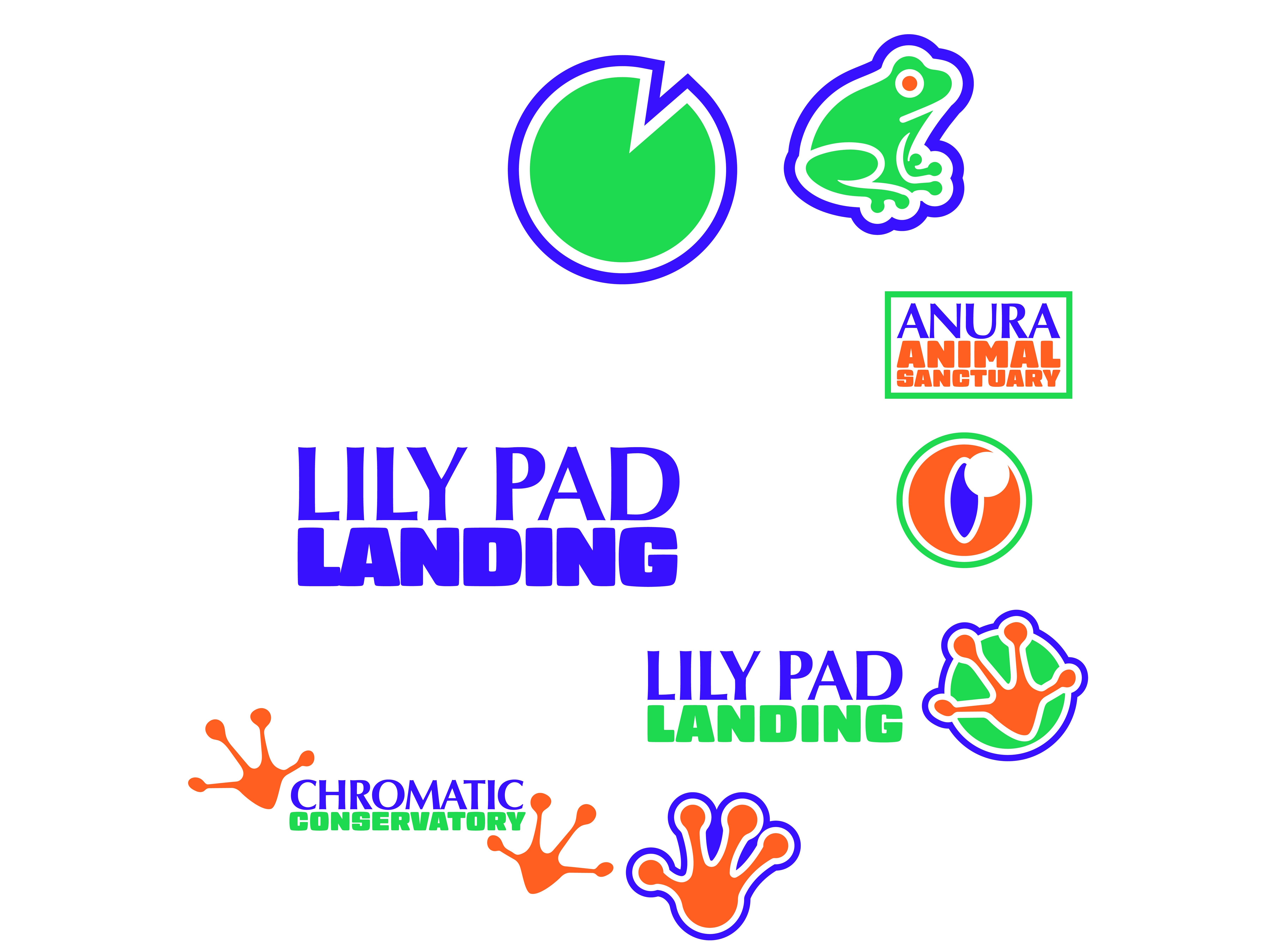
Initally I had the idea of using a frog or a macaw as a mascot
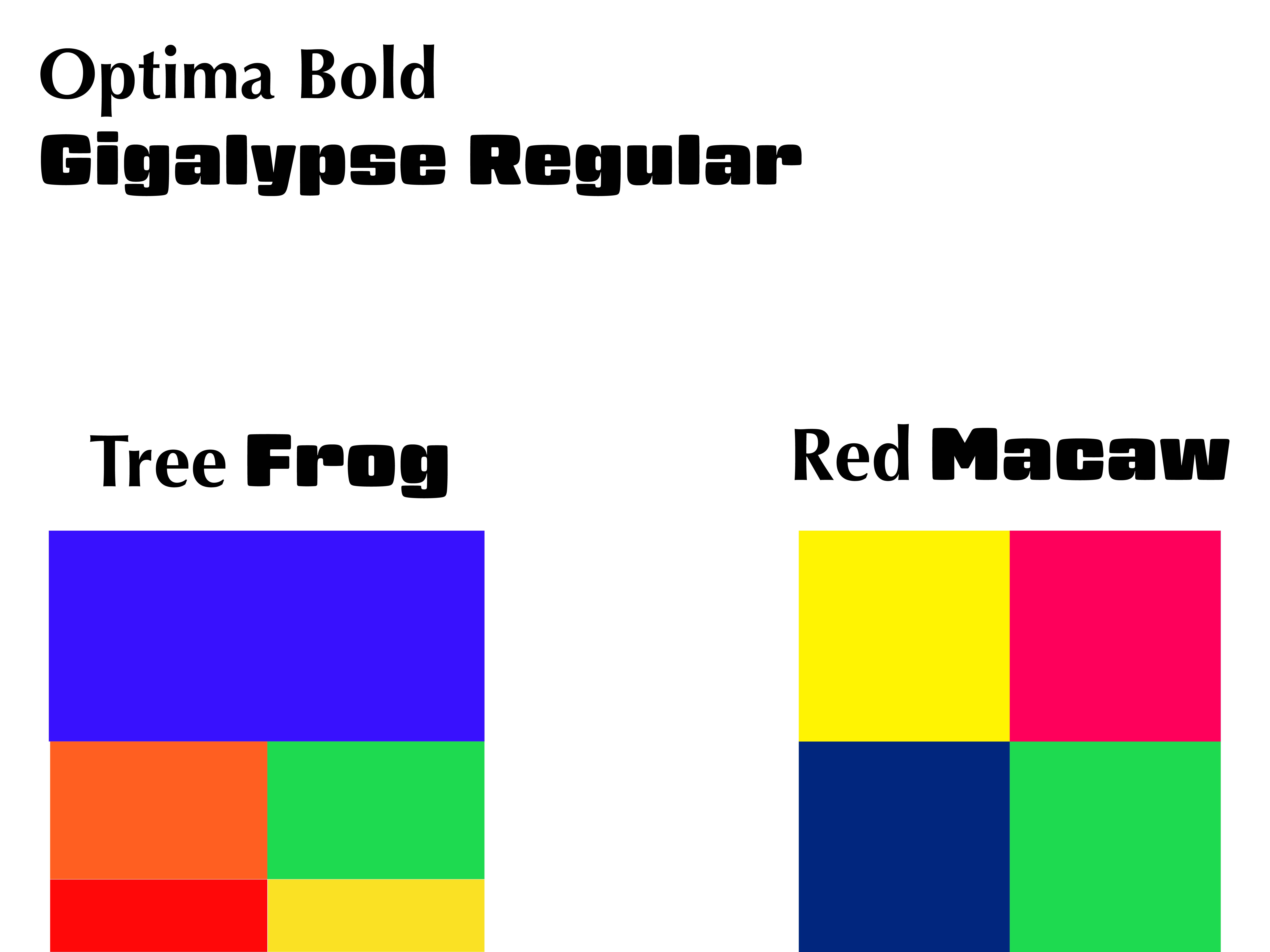
Once I started working digitally, I had an idea of the color palettes and fonts I wanted to use
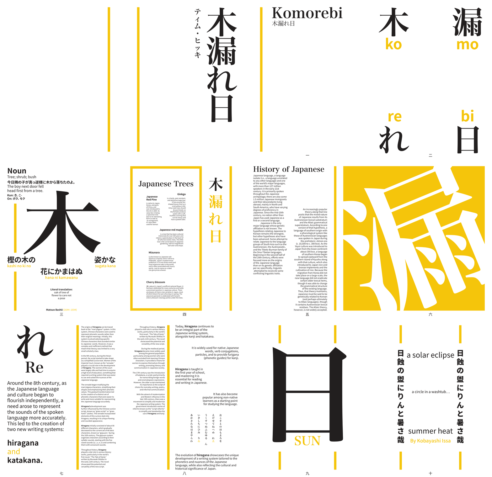
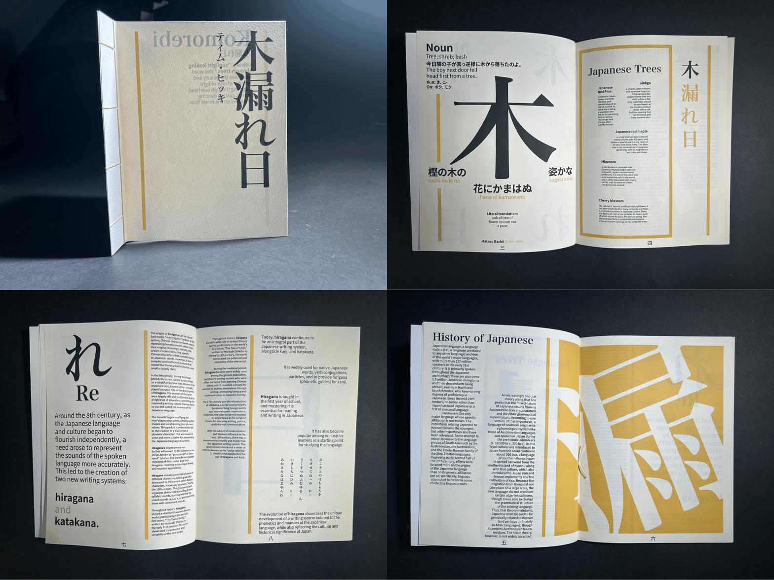
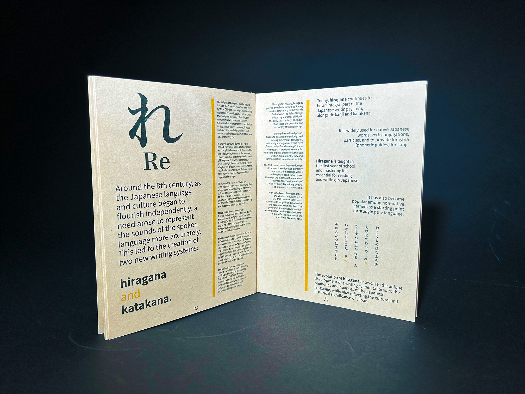
For this project, my task was to take a word from a foreign language that doesn't have a direct translation in English and design a booklet for it.
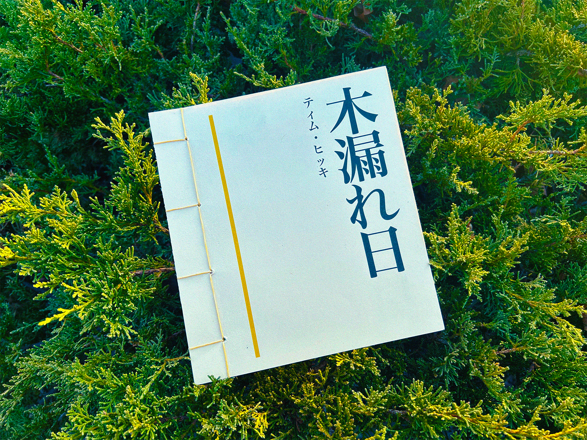
Out of the words I could choose, I decided to use the Japanese word "Komorebi".
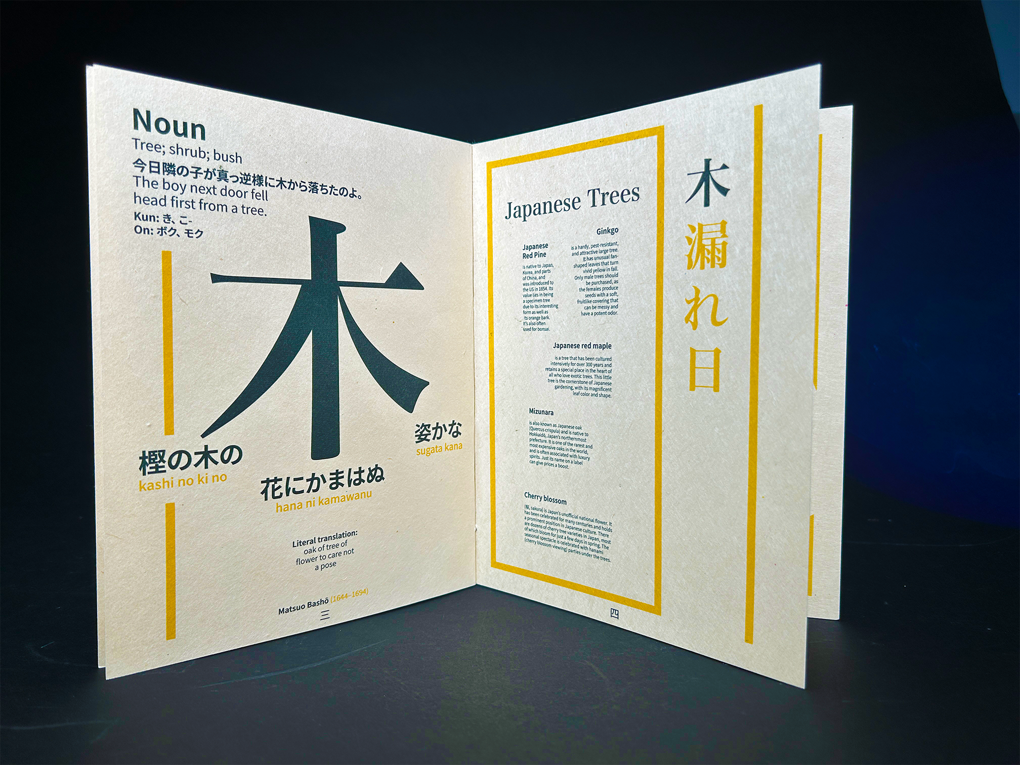
This word roughly translates to "sunlight leaking through trees", and is used to describe the beauty of light rays bleeding and seeping between the leaves of the canopy of a tree/forest.
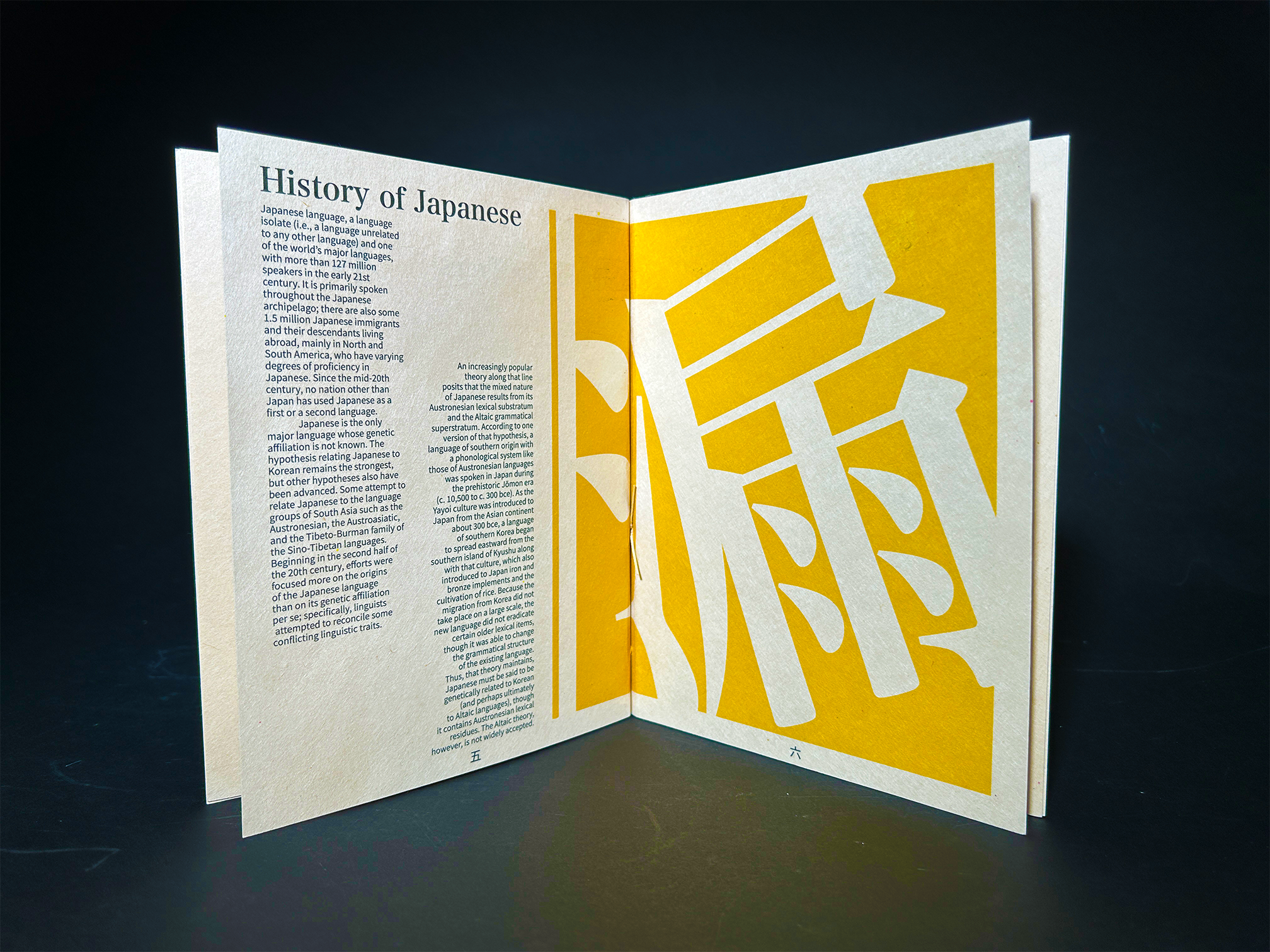
Having access to another language allowed for more creativity within the design, and since I'm also learning Japanese, I was able to apply some of the knowledge I have about the language to this project.
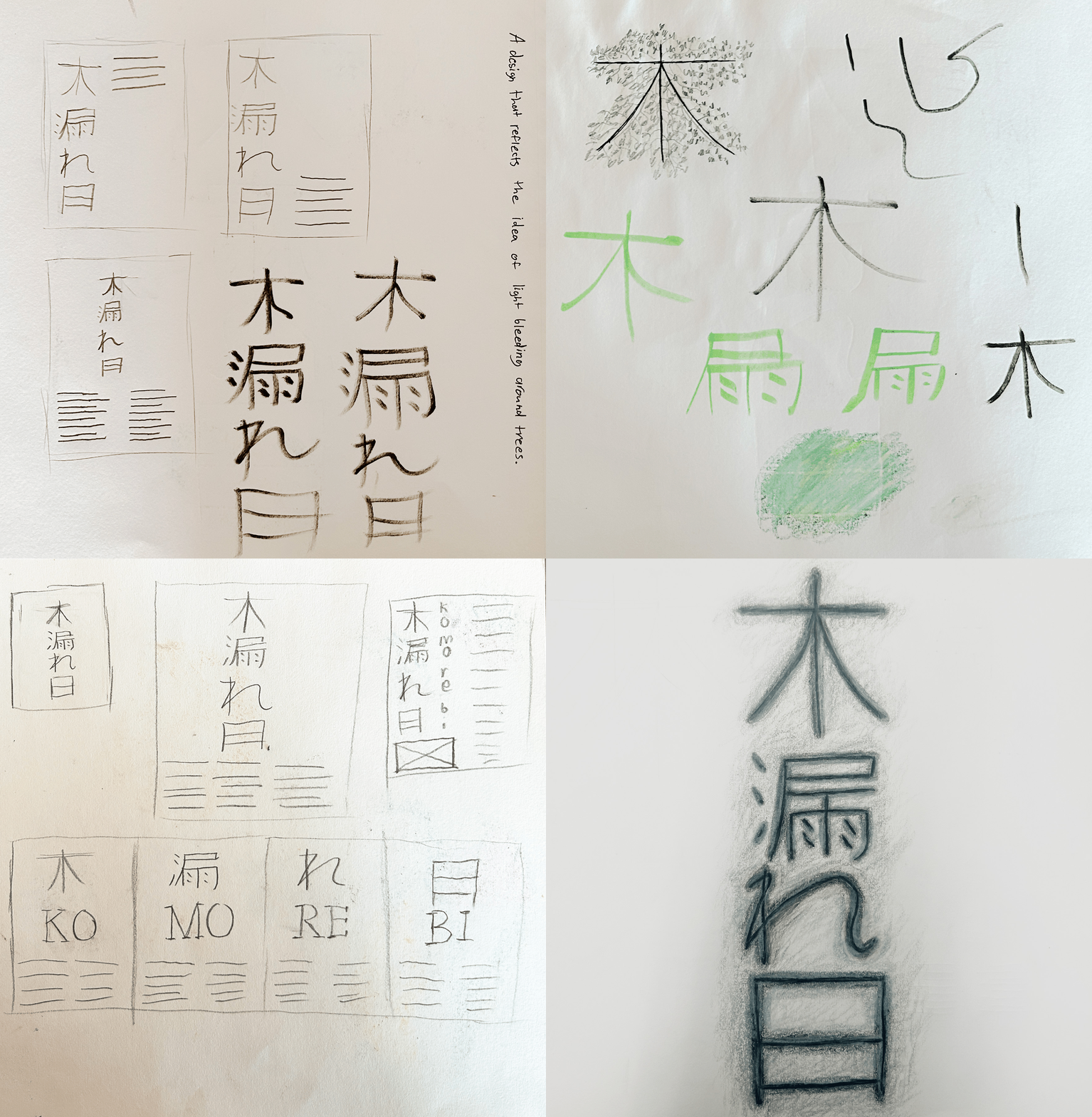
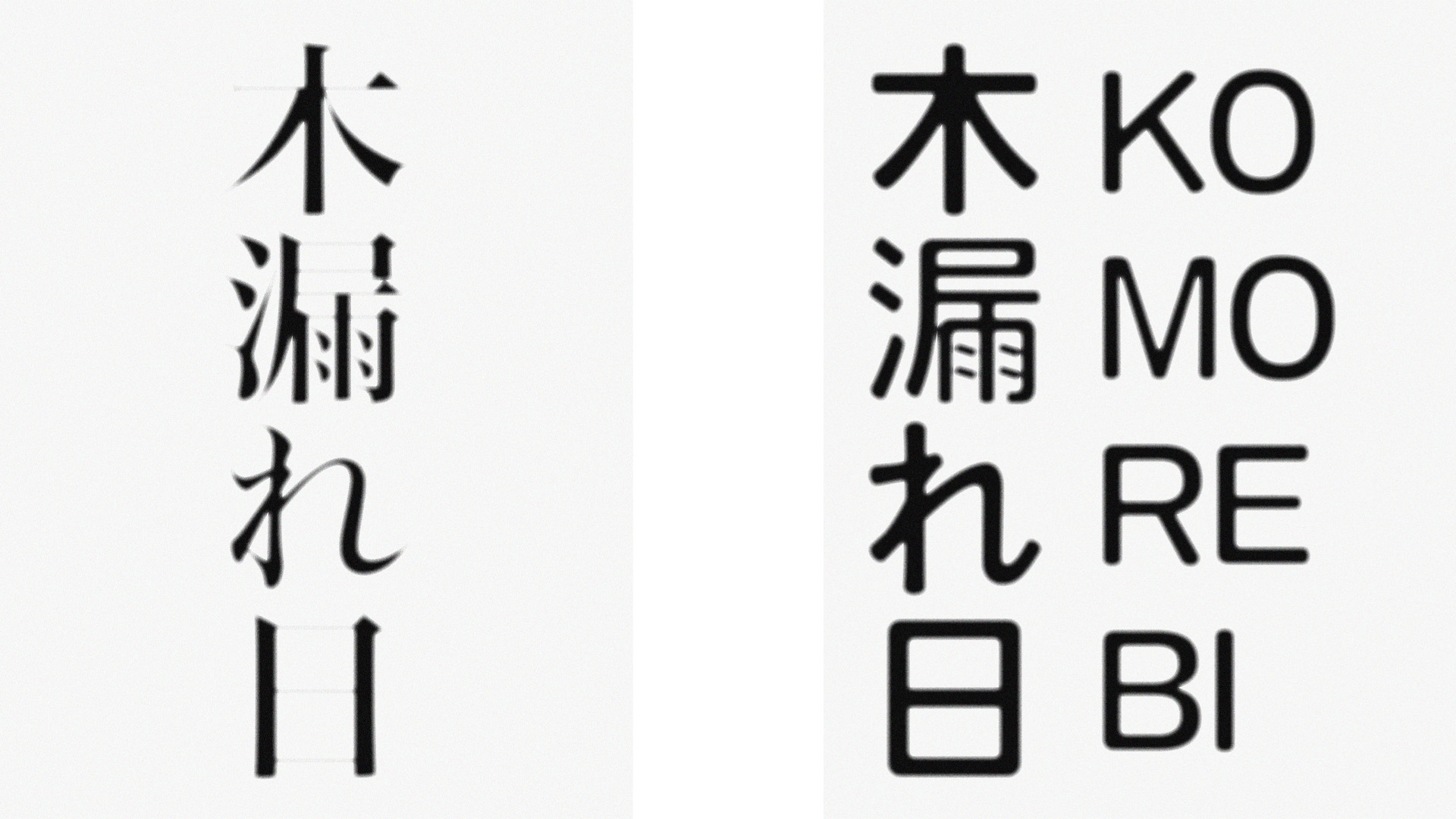
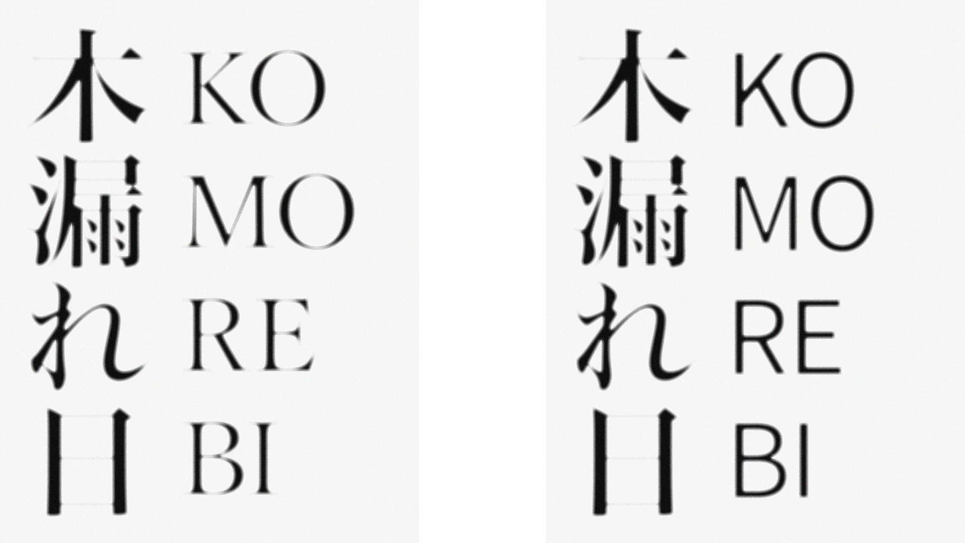
Initally worked on the cover page of the booklet and wanted it to reflect the meaning of "komorebi" by having the page bleed around the characters
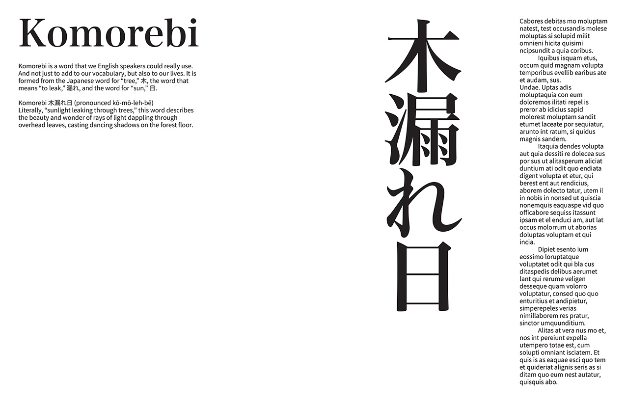
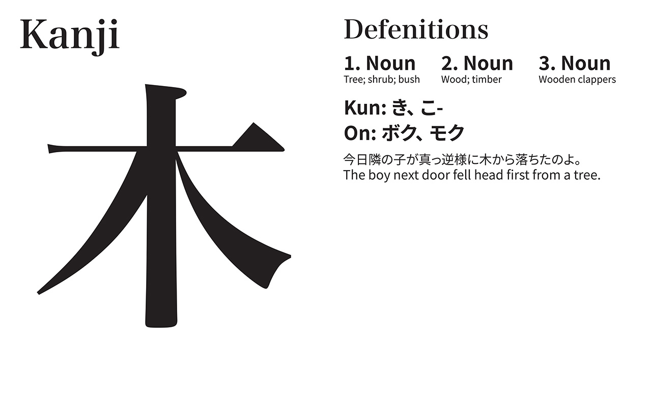
Iterated my initial cover page into two spreads breaking down the meaning of the word